Meta: The Impact is Real Brand Films_Creative Direction
——
——
——
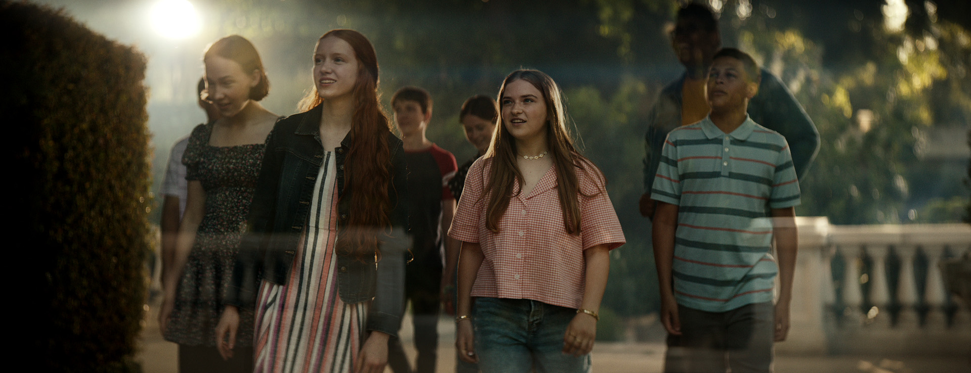
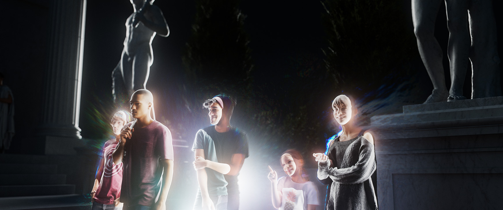
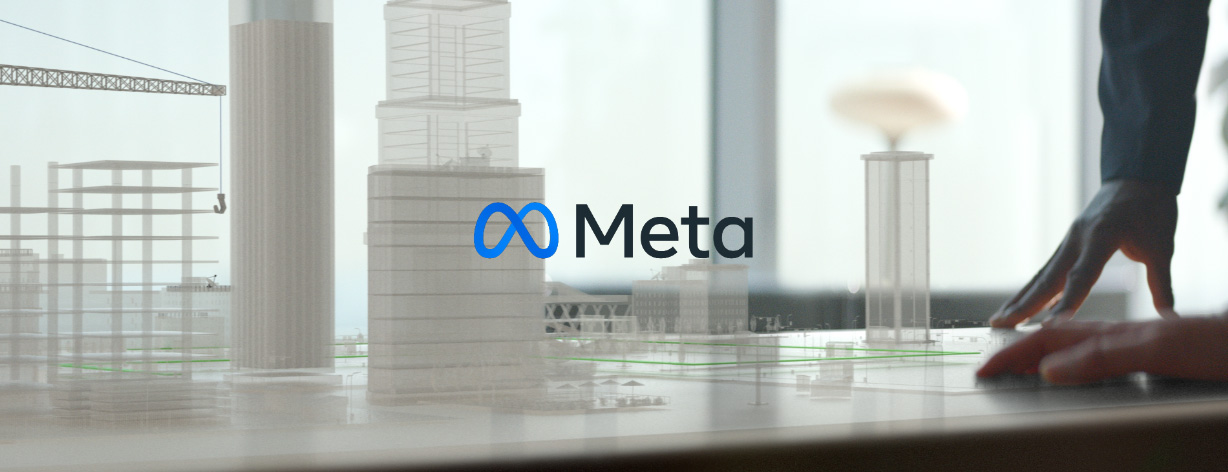
Being able to part of a project from pitch to production is always the most exciting and most rewarding, but even more so in this case as I was able to work with the amazing director David Slade (Black Mirror: Bandersnatch, Hard Candy, 30 Days of Night). In the beginning it was just David and I, along with executive producer Paul Abatemarco, developing the look and feel and story of how to represent the metaverse, in a pitch for Mark Zuckerberg. The explorations led us to a heightened sense of reality, not a cartoon world, which drew from some of my favorite examples in fine art such as Caravaggio and Gregory Crewdson. I developed the look for each vignette in 3D space - using references from the location scouting - to nail each shot before shooting and production began.
Client: Meta
—
Directed by: David Slade
—
Creative Direction: Jason Forrest Hogg
—
Studio: Logan
——
——
——
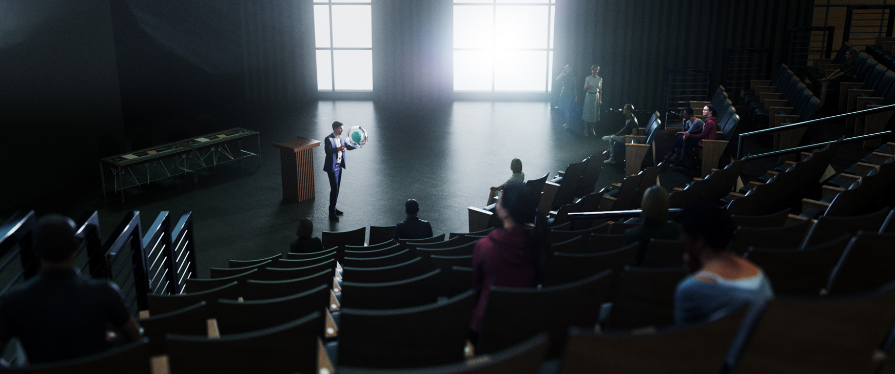
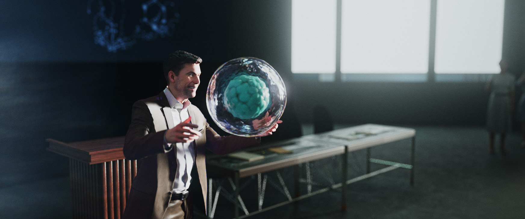
The Impact is Real_Lecture Hall
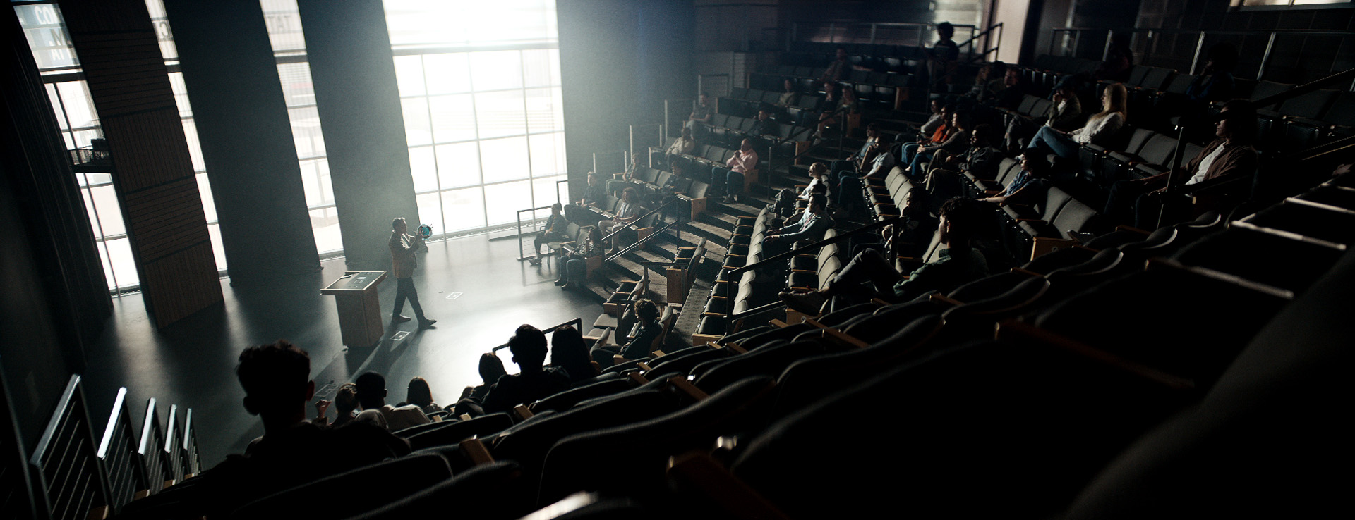
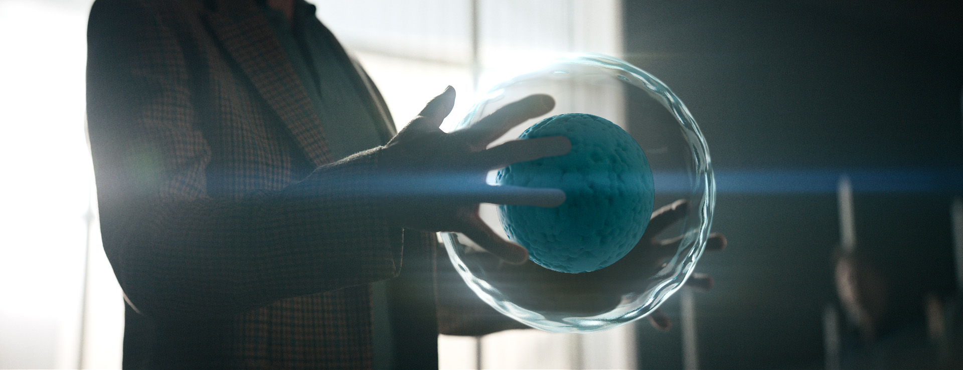
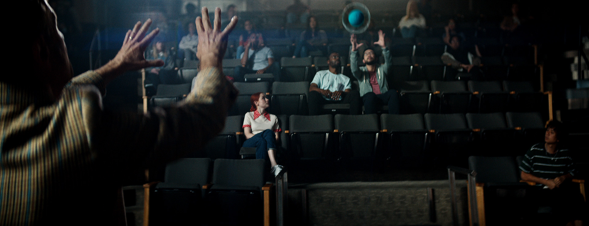
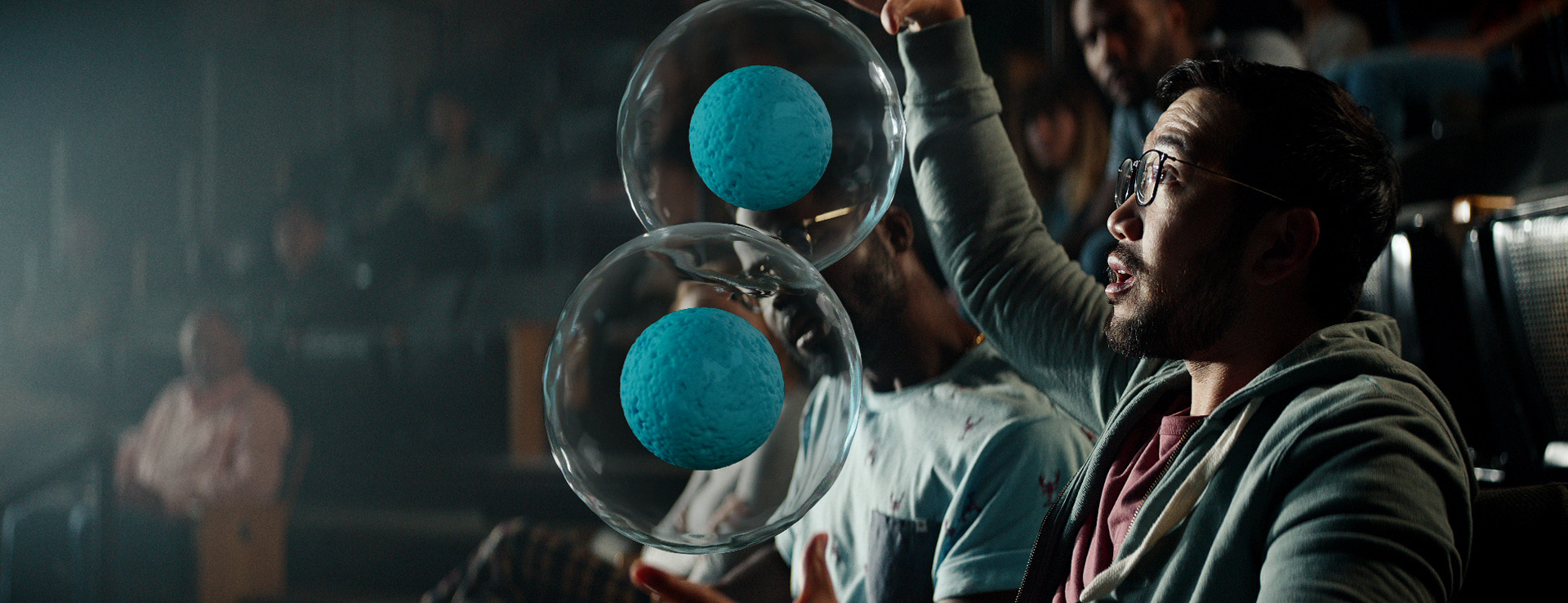
We initially established framing of the scene and I worked with director David Slade to design the overall looks and feel of the environment with dramatic lighting. Once locations were scouted I was able to create a rough model of the lecture hall in C4D and transfer my lighting tests to this environment. I also developed the dividing cell used by the professor.
Style Frames_Concepts and Art Direction
——
——
——
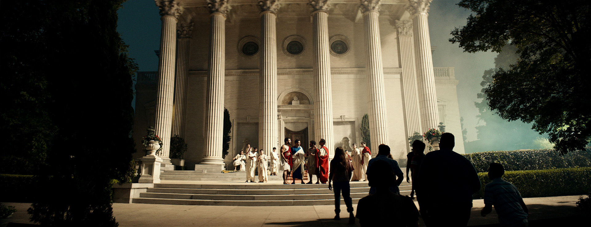
The Impact is Real_Ancient Rome
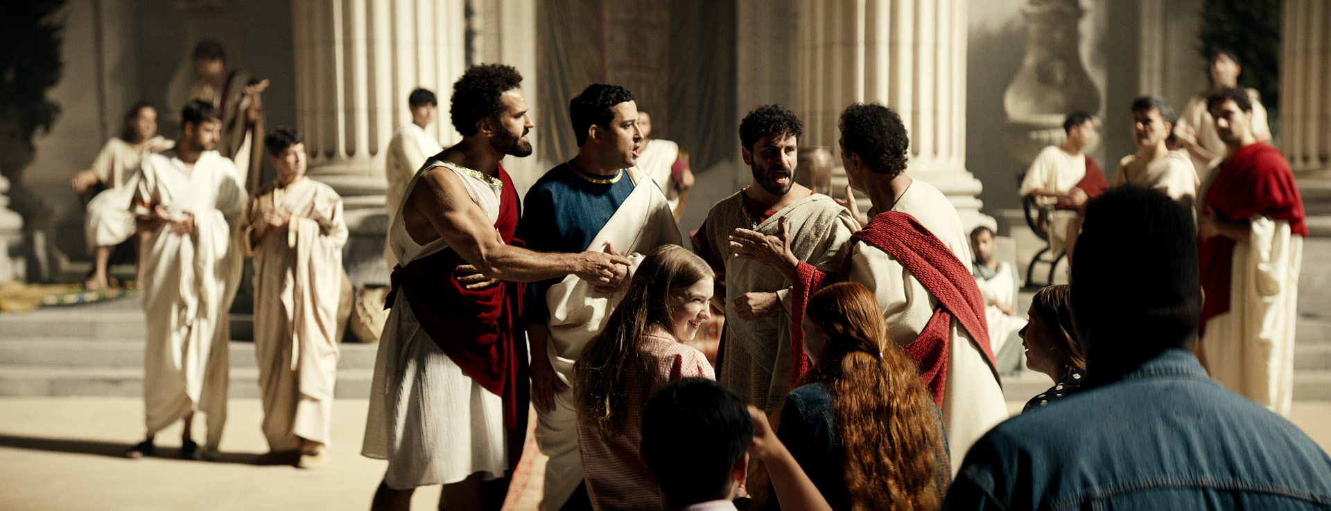
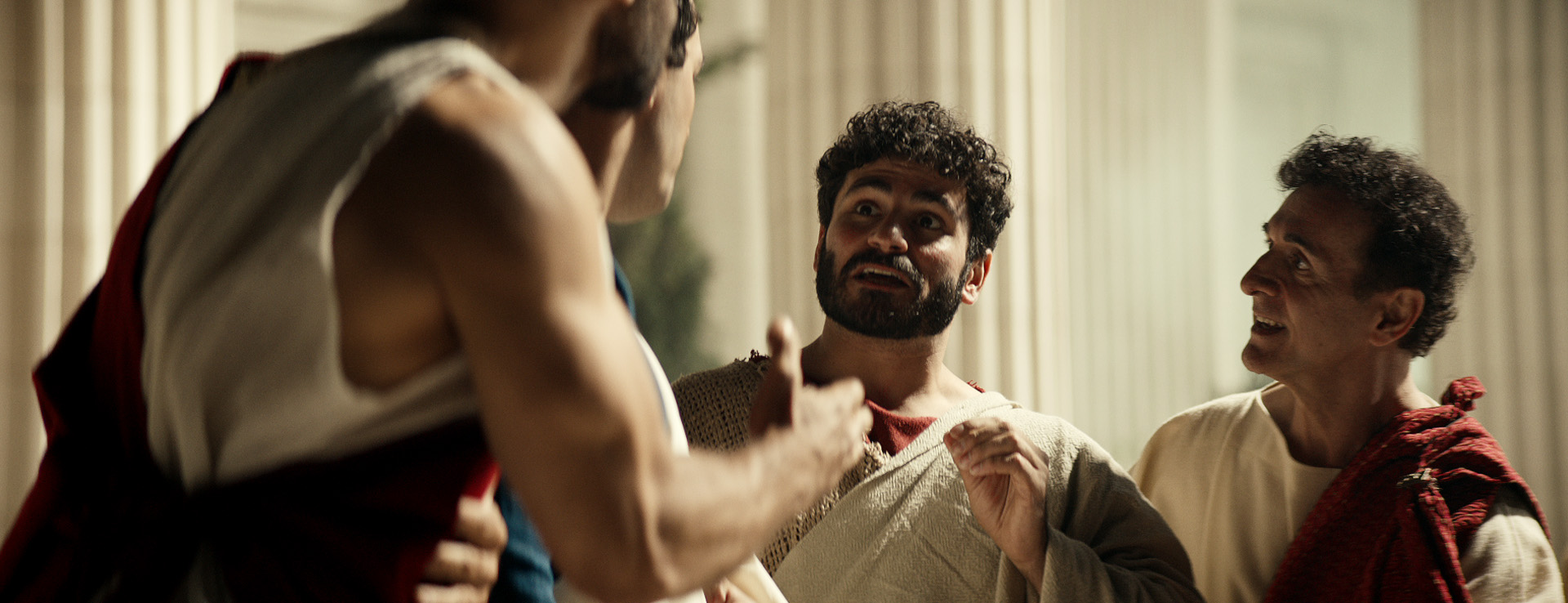
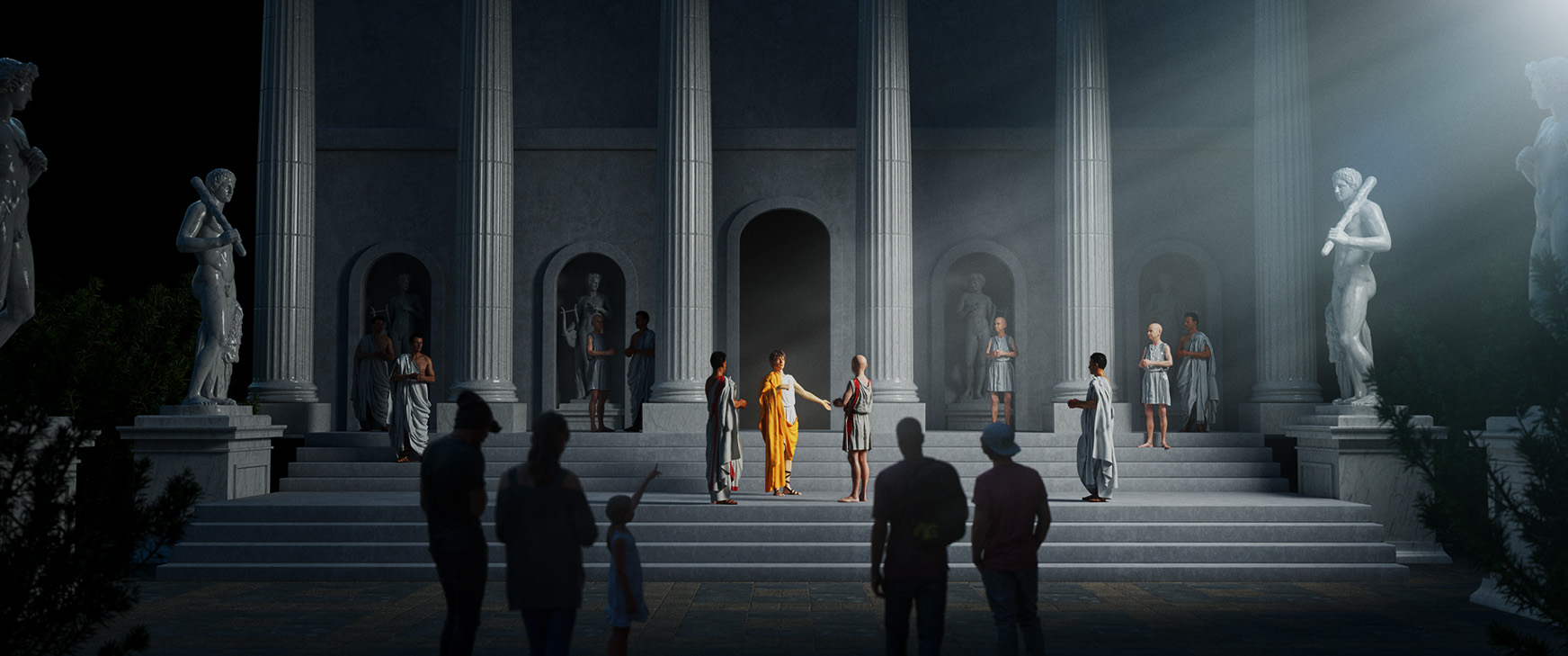
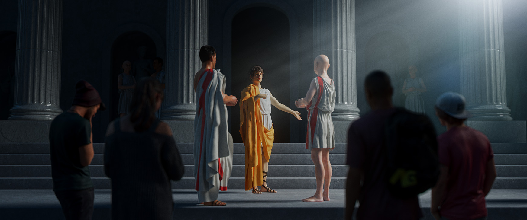
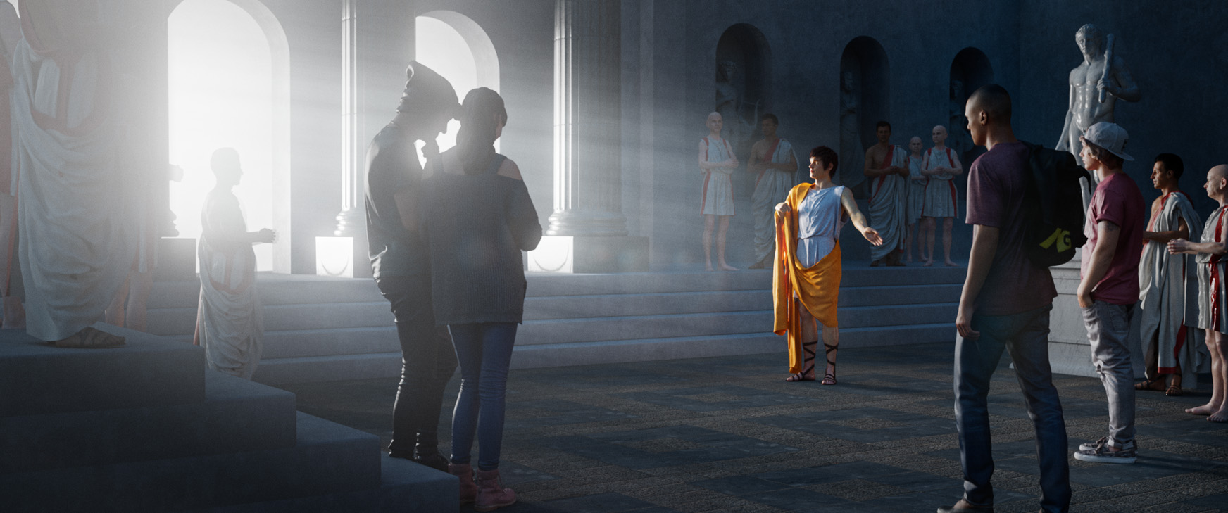
For the Ancient Rome spot, we had initially planned for it to take place inside, but moved it outdoors after location scouting. We stripped the down of most of the planned VFX to focus on the immersive history lesson, which was influenced by the Renaissance and Neo-Classical artists such as Jacques Louis-David.
Style Frames_Concepts and Art Direction
——
——
——
The Impact is Real_Heart Surgery
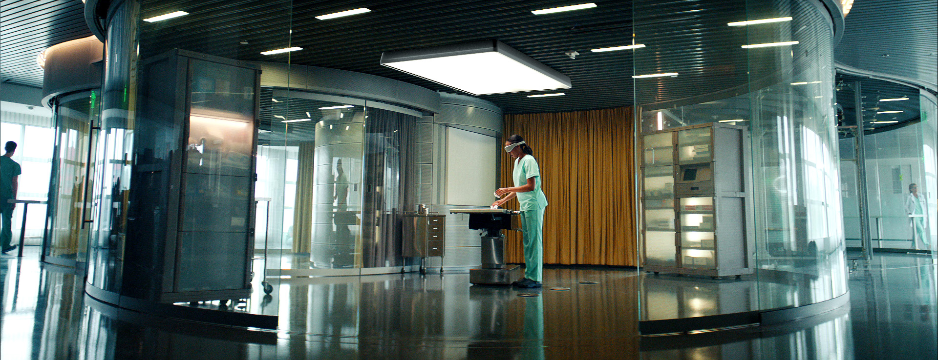
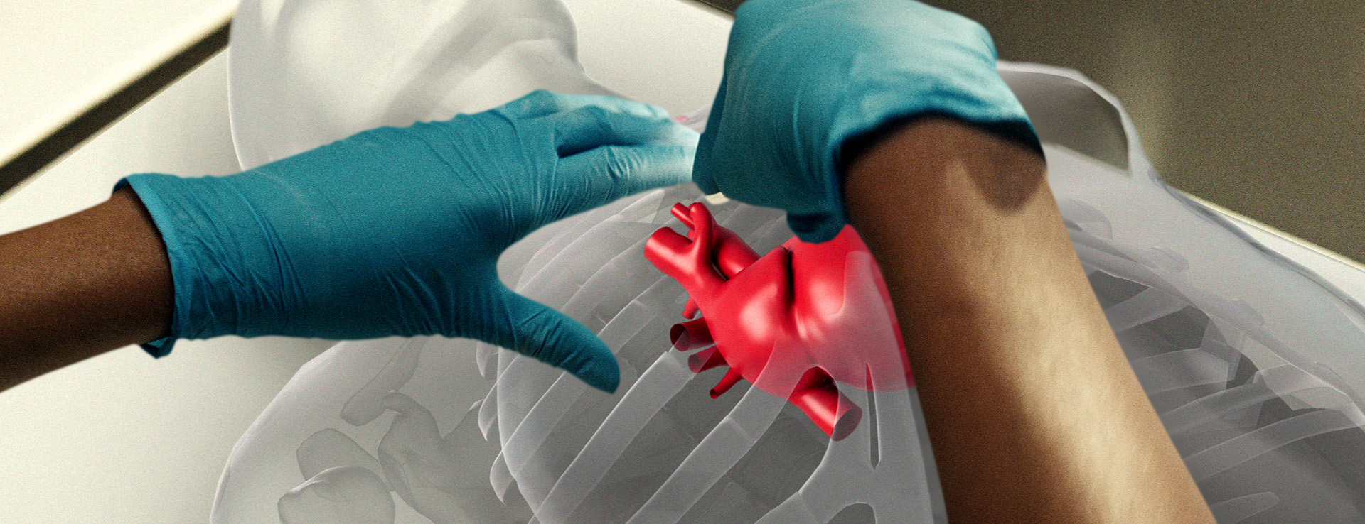
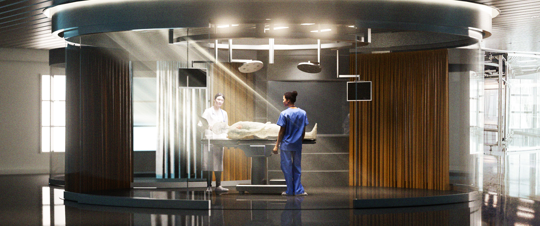
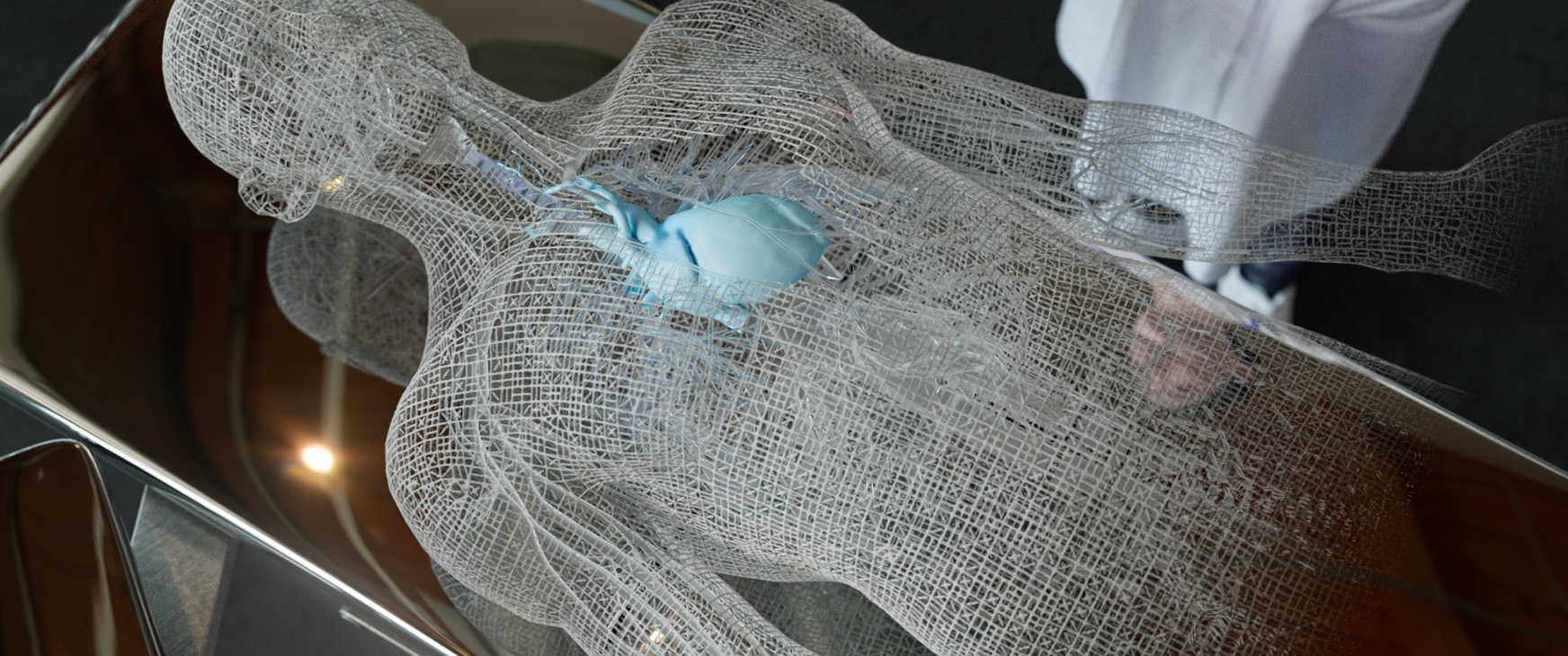
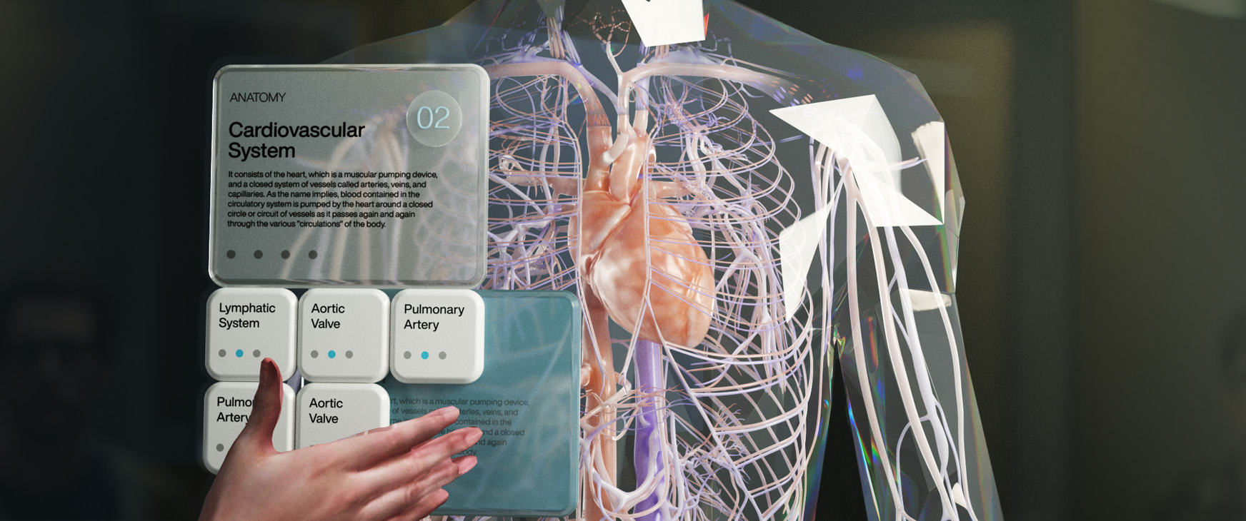
We were able to scout this location early on, so I was able to design the environments with the final product in mind right from the start. We needed to keep the classical, dramatic lighting used throughout the campaign. The model of the body and heart went through several iterations, as we had something more unique in mind but ended up referencing a more minimal AR look.
Style Frames_Concepts and Art Direction
——
——
——
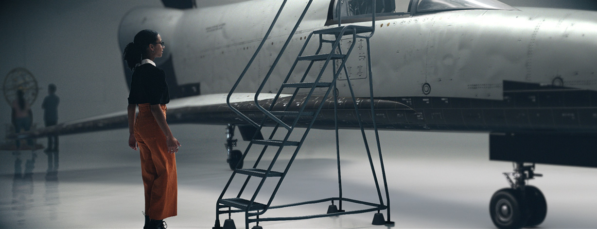
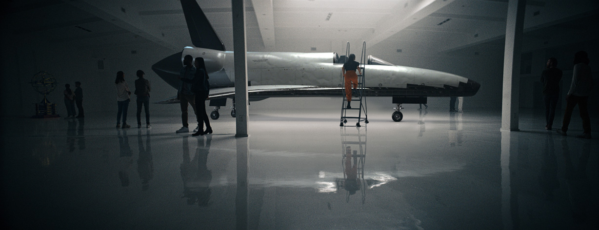
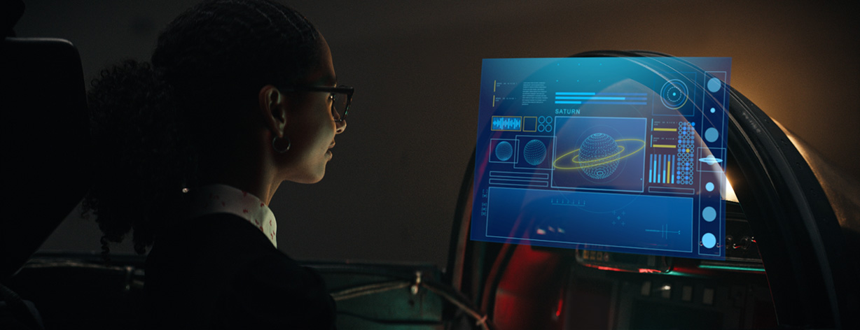
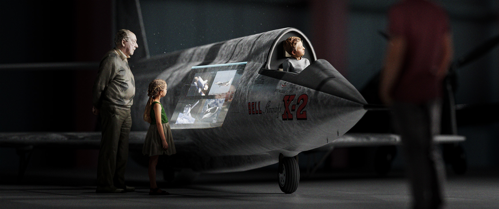
The Impact is Real_Aerospace Museum
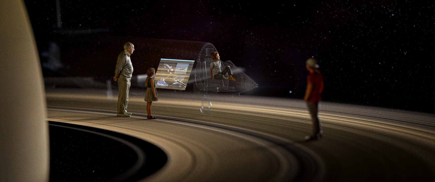
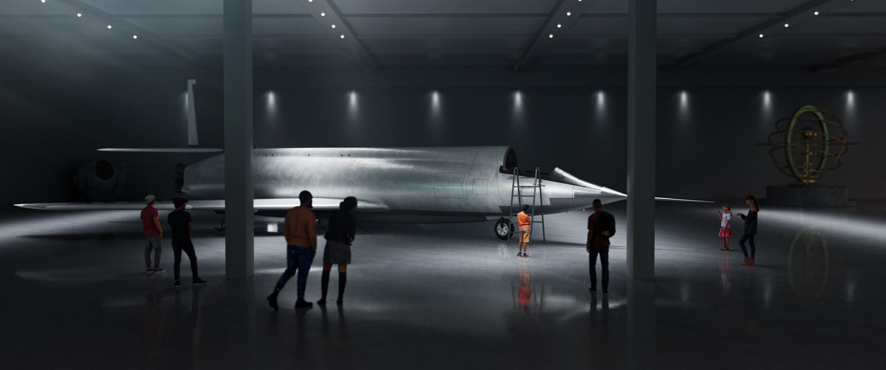
The design for the Aerospace Museum actually ended up looking quite a lot like the warehouse we eventually used. The top lit room and reflective floor lended itself well to the overall look and feel of the campaign. While the internal team at Meta designed the UI for the space ship, I developed the look of being on the rings of saturn, which was originally an interactive space outside of the ship.
Style Frames_Concepting and Art Direction
——
——
——
The Impact is Real_Anatomy Lesson
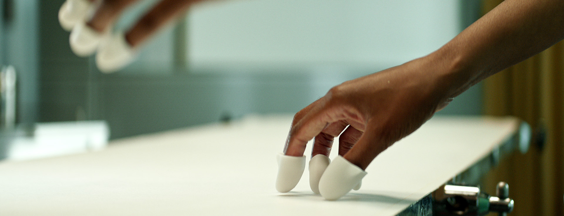
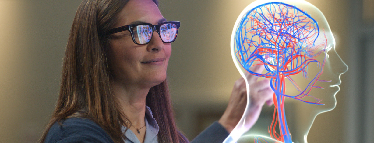
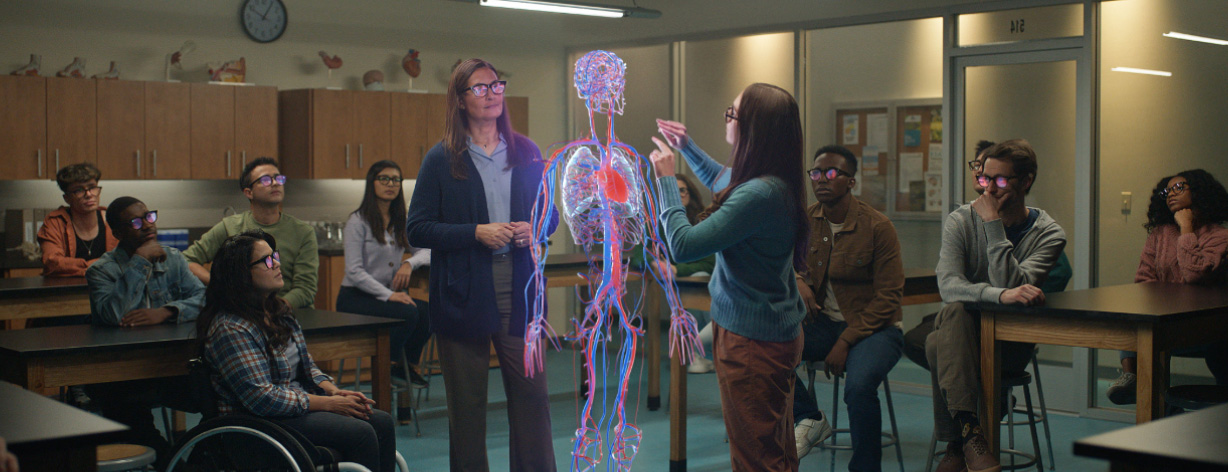
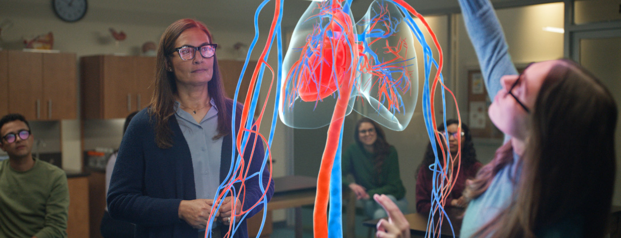
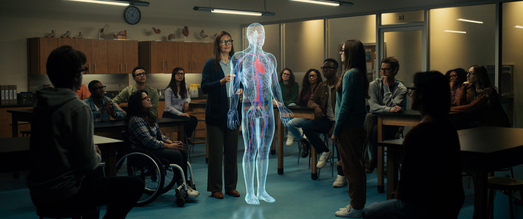
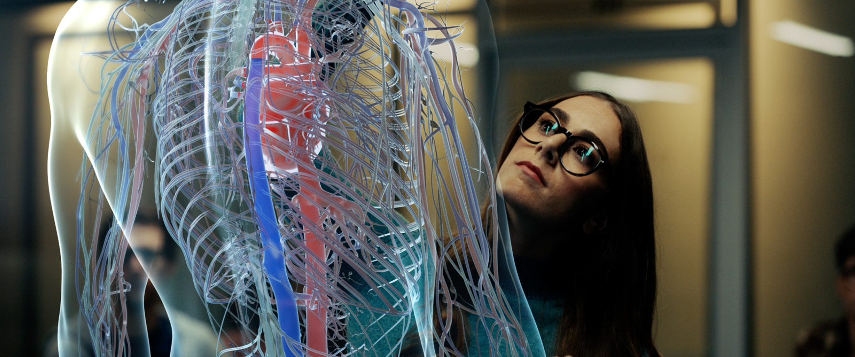
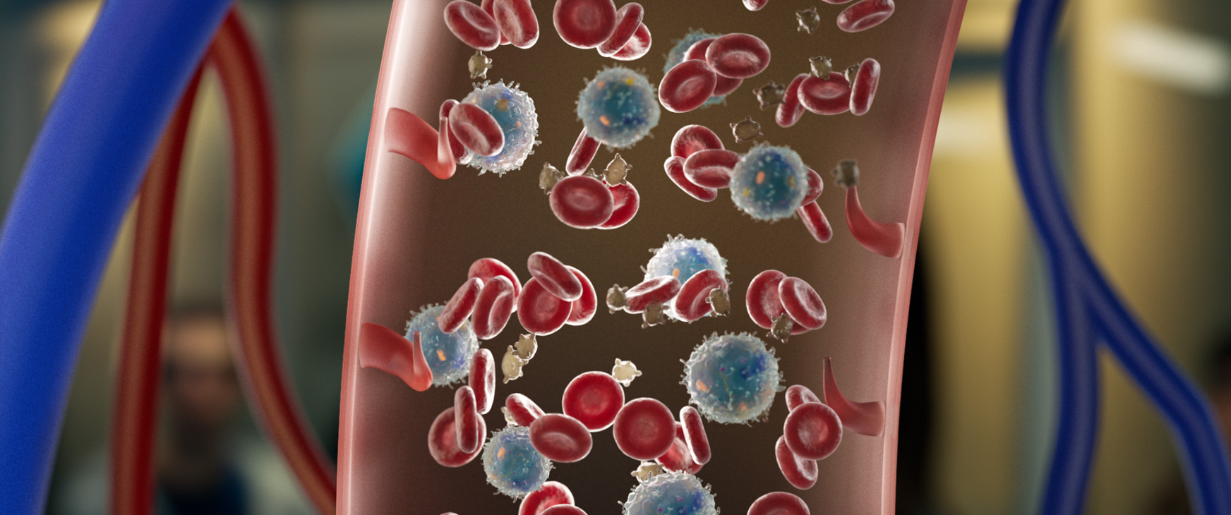
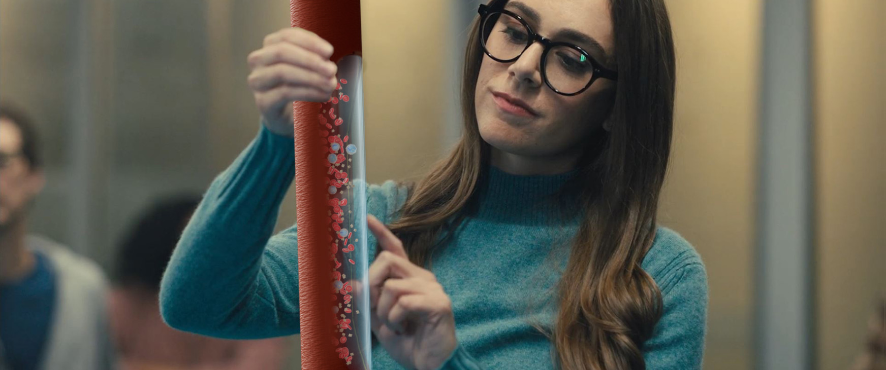
For the Anatomy Lesson spot, we had to figure out how to portray the body's systems, balancing making it somewhat realistic and accurate without looking too creepy. I also designed how the microscopic blood flow looked and how the student reveals the inside with a swipe of her finger.
Style Frames_Concepts and Art Direction
——
——
——
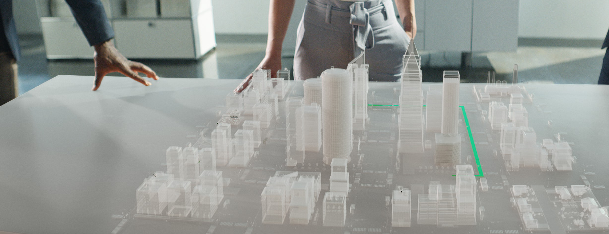
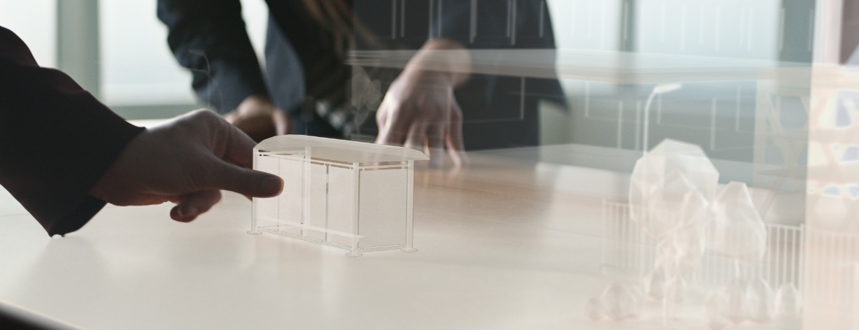
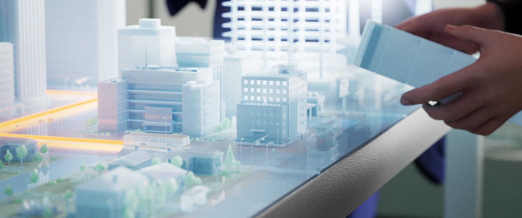
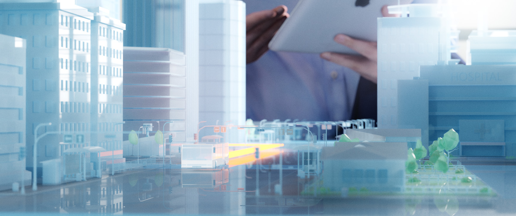
The Impact is Real_Urban Planning
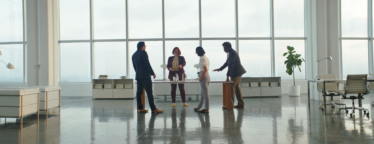
Working with the bright environment of the urban architects' studio, I designed some of the shot framing and the look of the city. How it ended up looking in the end was slightly more minimal, which goes along with the AR look in some of the spots.
Style Frames_Concepts and Art Direction
——
——
——
( Hello )
This is the work of designer / director Jason Forrest.
( Contact )
Los Angeles, CA
jason@forresthogg.com
