Alien: Romulus UI Design_Creative Direction
——
——
——
I was thrilled to play a key role in shaping the visual language of Alien: Romulus, the latest chapter in a franchise that has been a creative touchstone for me for years. Directed by horror master Fede Alvarez, this film bridges the timeline between the iconic first and second installments, offering a rare chance to reimagine and expand the series' visual storytelling.
As Creative Lead for screen UI, I led the design and animation teams to develop every on-screen graphic and device seen throughout the film. Our goal was to faithfully preserve the nostalgic CRT/analog aesthetic that defines the original, while weaving in subtle elements that hint at the evolution seen in later films. From interface logic to data-driven storytelling, every pixel served a purpose. Immersing myself in the rich lore of the Alien universe, I aimed to honor its legacy with thoughtful, story-driven design decisions.
Client: Twentieth Century / Disney
—
Directed by: Fede Alvarez
—
Creative Lead: Jason Forrest Hogg
—
Studio: Logan
——
——
——
Jackson's Star Colony
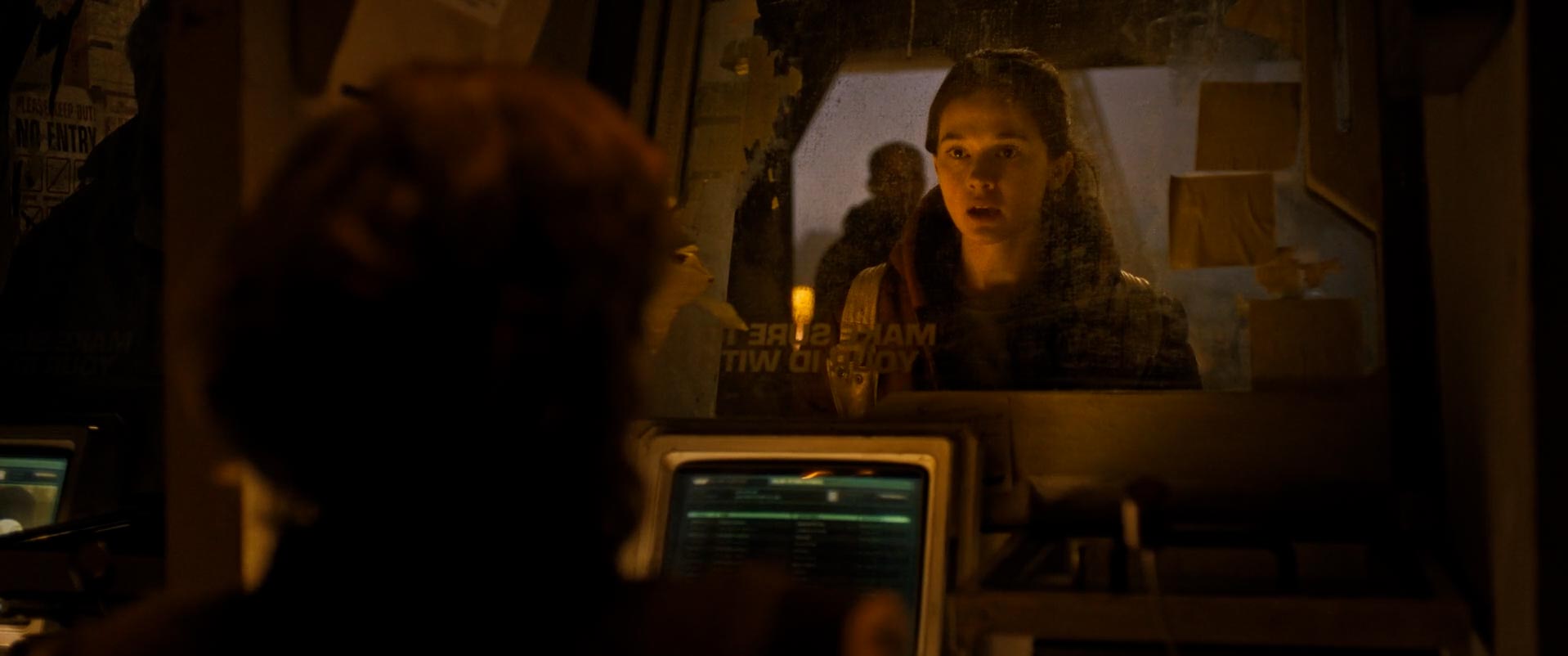
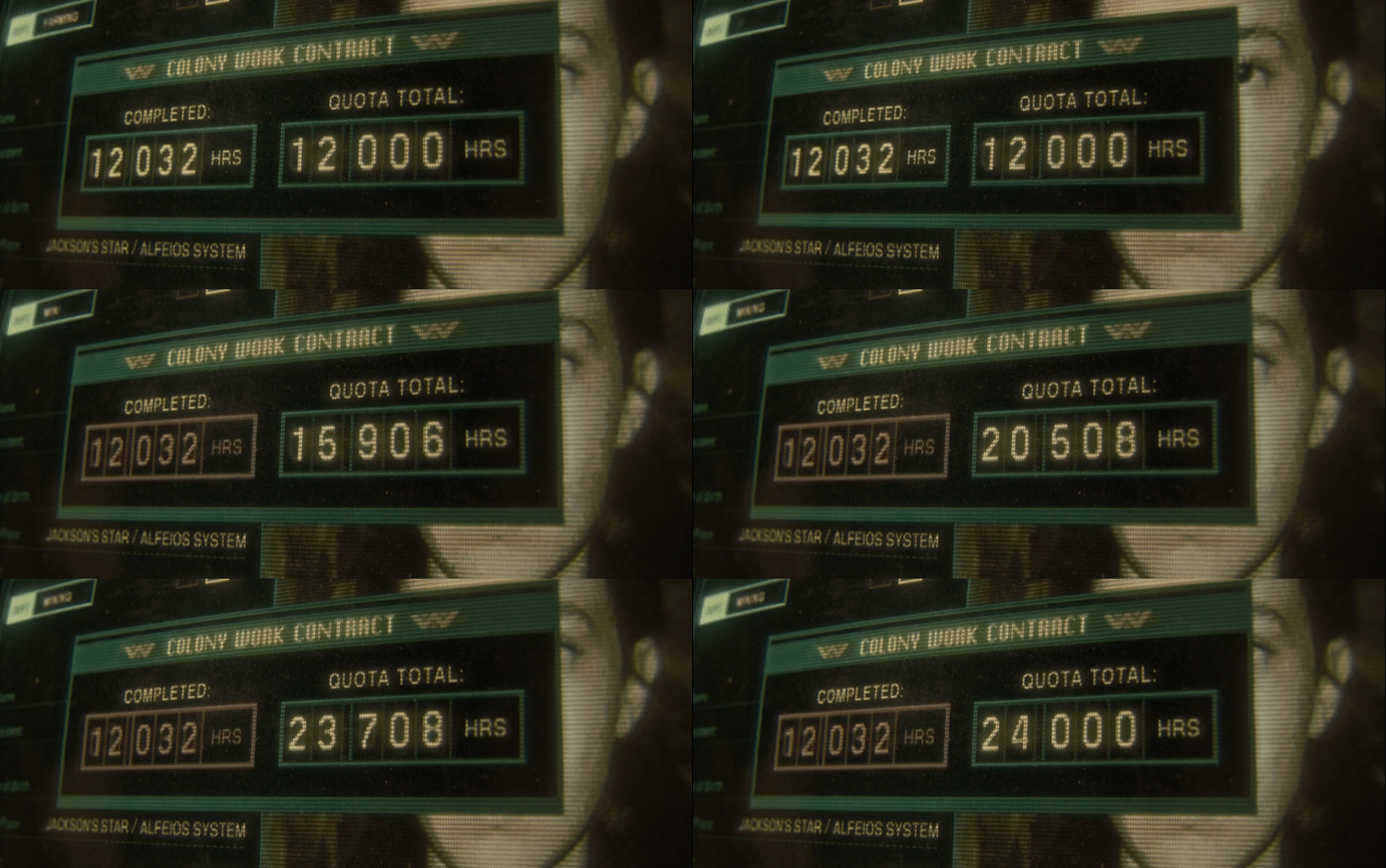
The Jackson's Star colony shows the characters living in a corporate hellhole in the outskirts of space. The design of the Colony Affairs terminal is a sort of retro futuristic Excel spreadsheet, intentionally a very utilitarian and no-very-cool app used by the beurocrats and bean counters of the Weyland Yutani company, whose logo is ubiquitous throughout the film. Tyler's computer terminal has a little more style, with a WY bootup screen and custom ASCII art, before it shows the Renaissance Station's manifest that he was able to hack.
Colony Affairs
Tyler's Trailer
——
——
——
The Corbelan IV
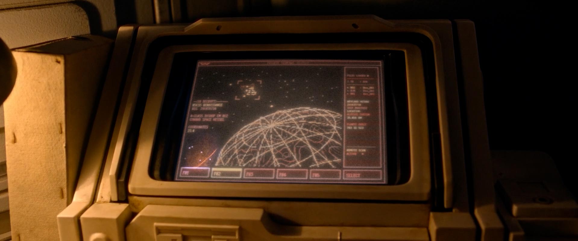
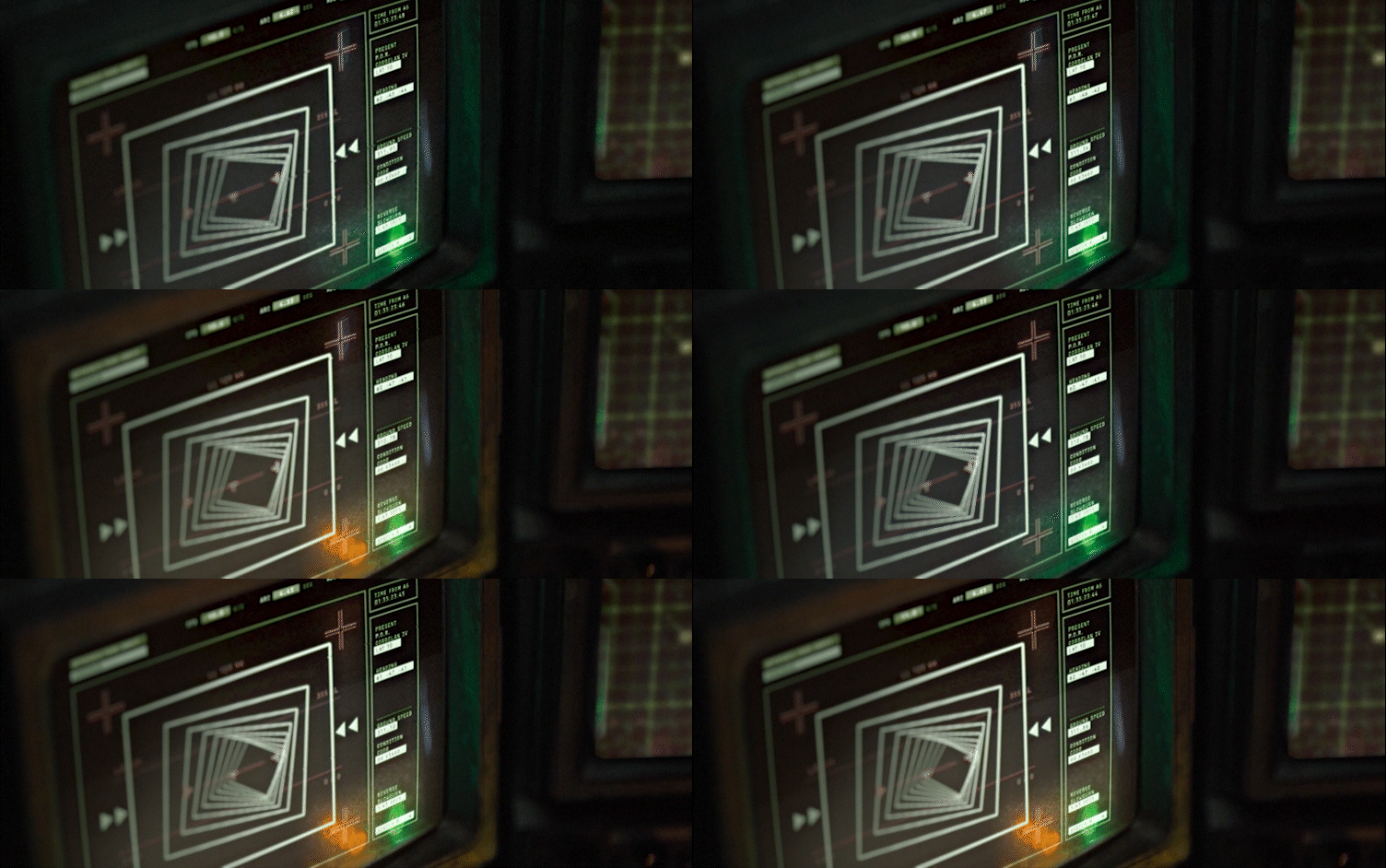
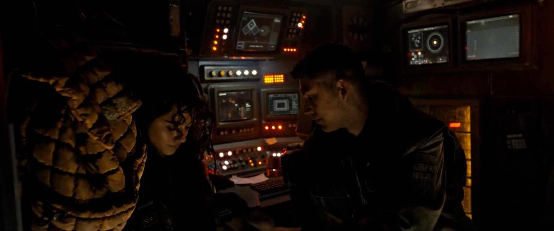
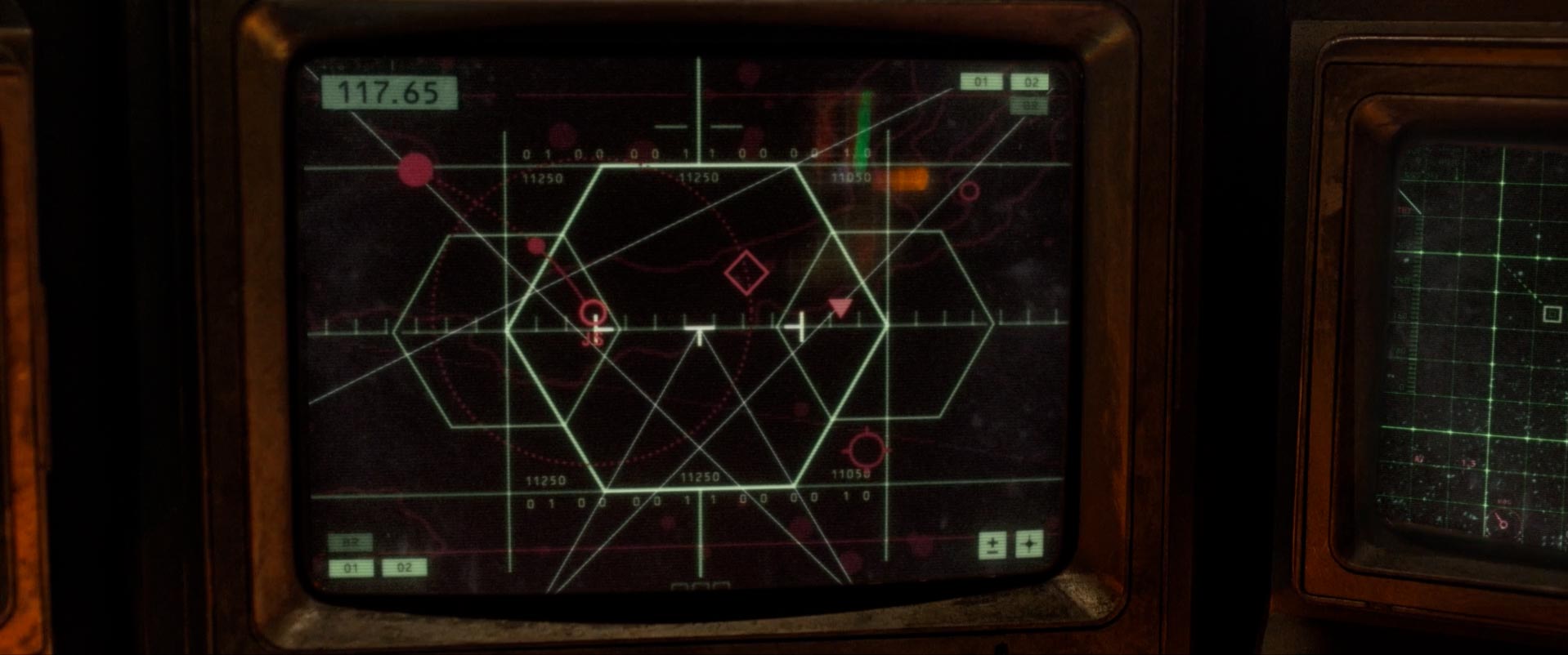
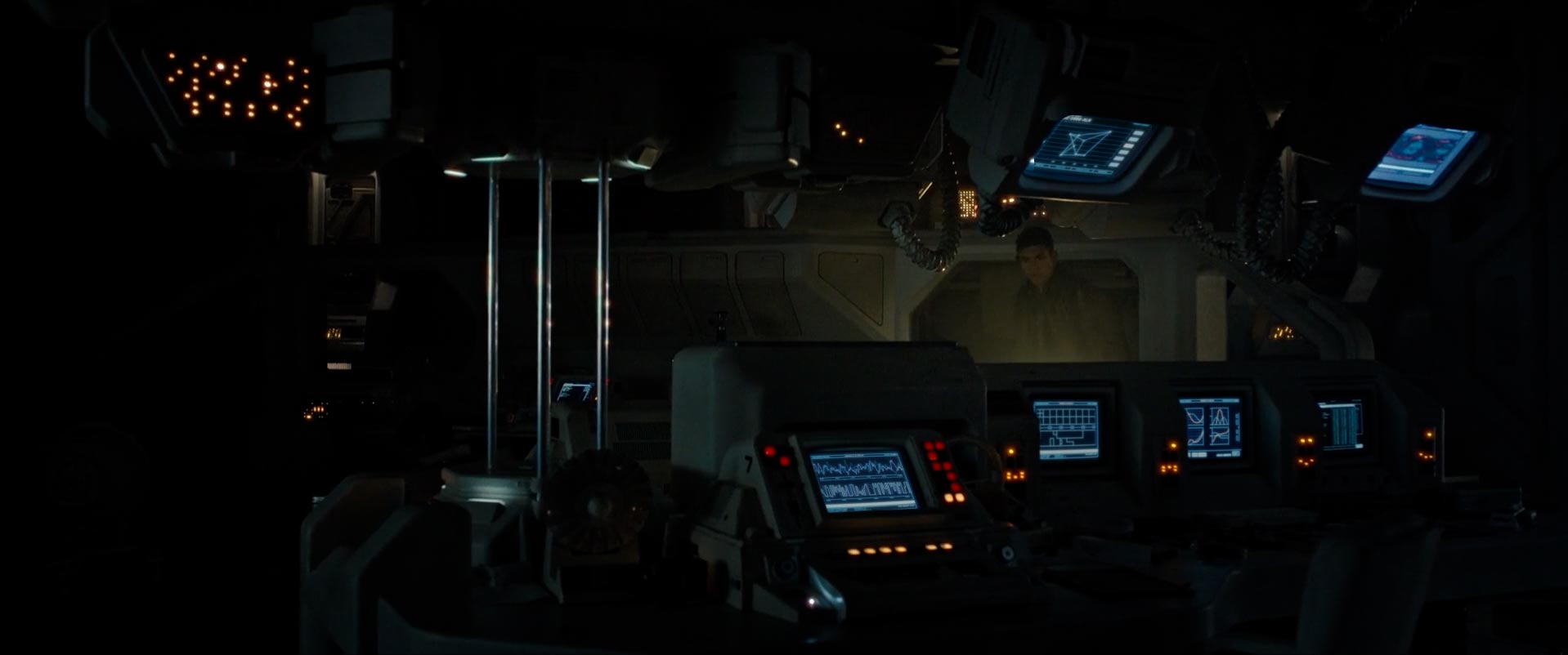
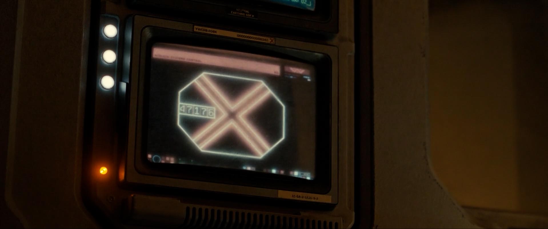
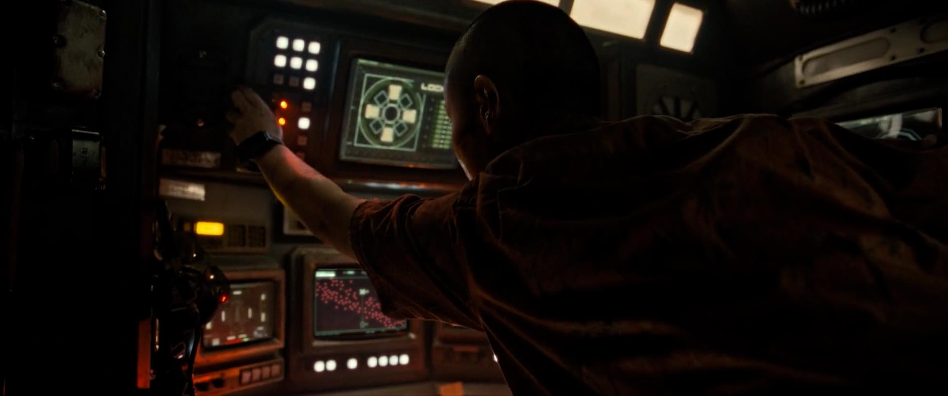
The USCSS Corbelan IV was a mining hauler owned by Weyland Yutani. As an old ship, its operating system was closer to the Nostromo (of Aliens) than the newer and more hi tech Renaissance Station or even what is seen on Jackson's Star. The UI includes a variety of piloting and navigational systems, some new and some borrowed from Alien (the airlock screen was one of the two screens used in Alien and Blade Runner).
The Cockpit
Corbelan Crash
——
——
——
Renaissance Station
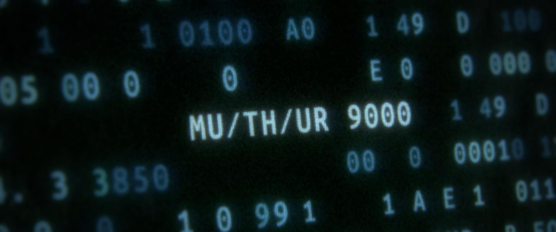
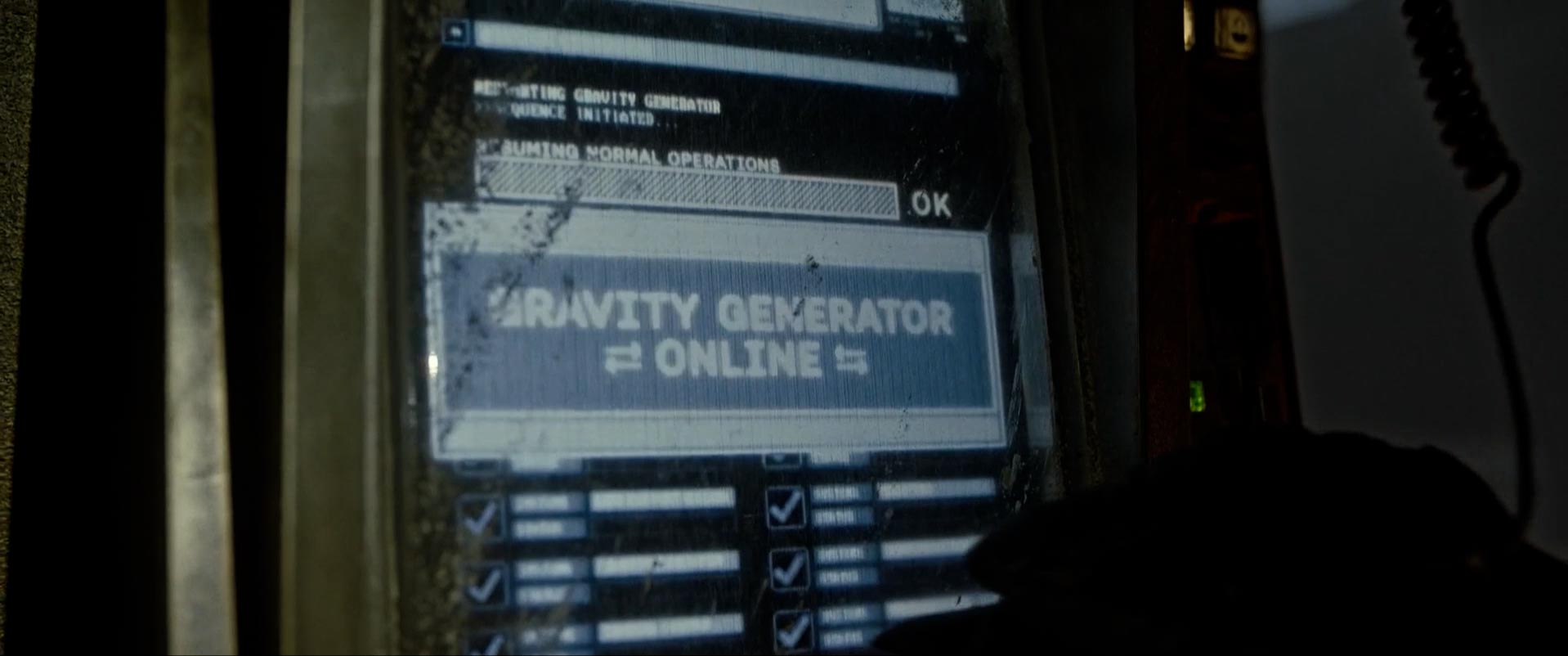
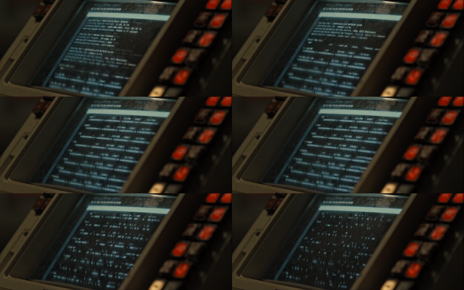
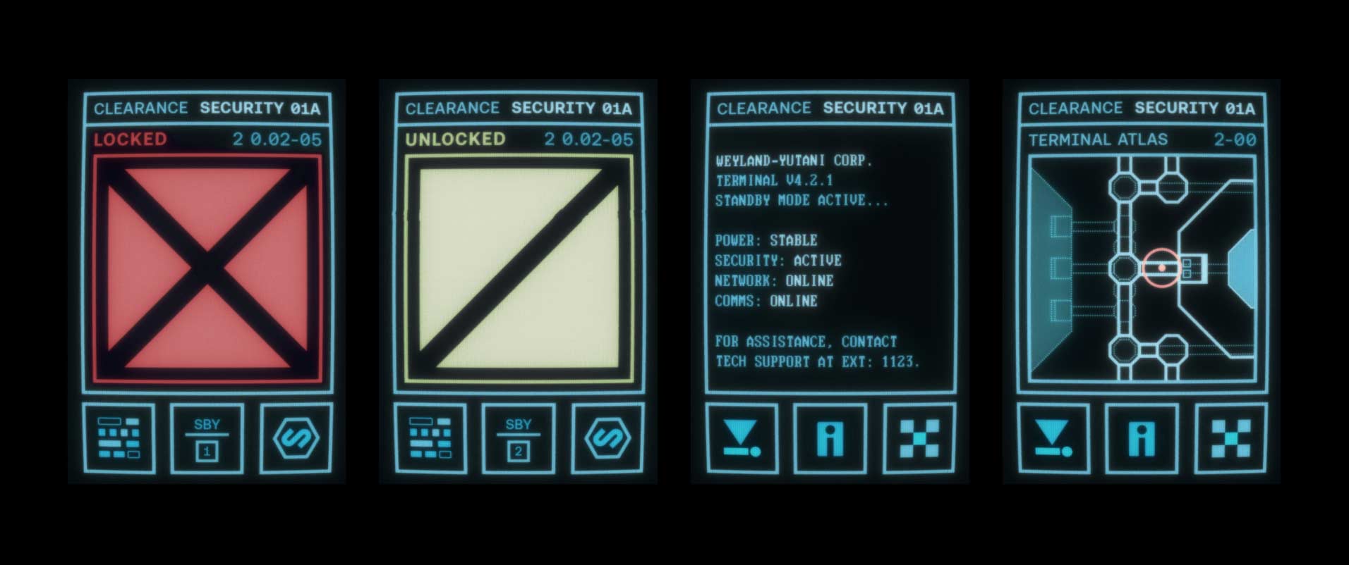
The doomed scientific research station that finds the alien artifact, had on board a more sophisticated high end WeYu computer system, built upon the MU/TH/UR 9000 OS. To contrast with the more rudimentary earth tones of the computers on the colony, the Renaissance Station features brighter screens primarily of blue with minimal accent colors. The screens are slightly more hires, using fonts and imagery that aren't as bitmapped. While still consistent with the aesthetic of the original film, I wanted to bridge the continuity of design between films by including some elements from Covenant.
Enter Through the Airlock
Remus Lab
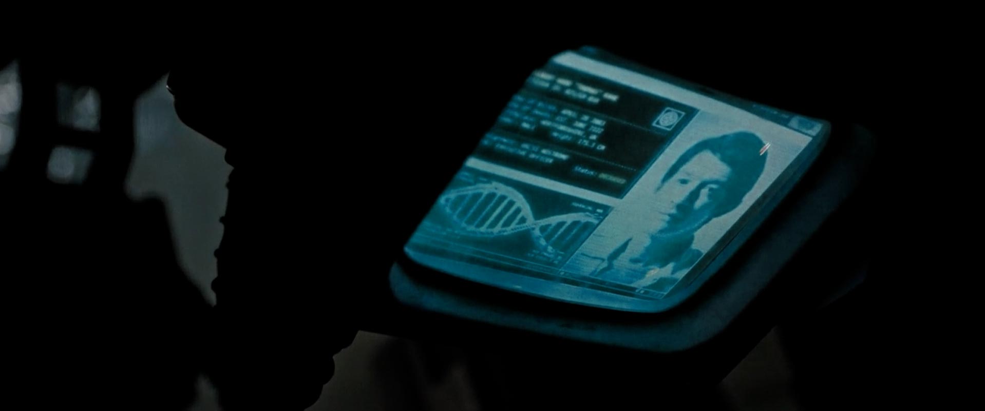
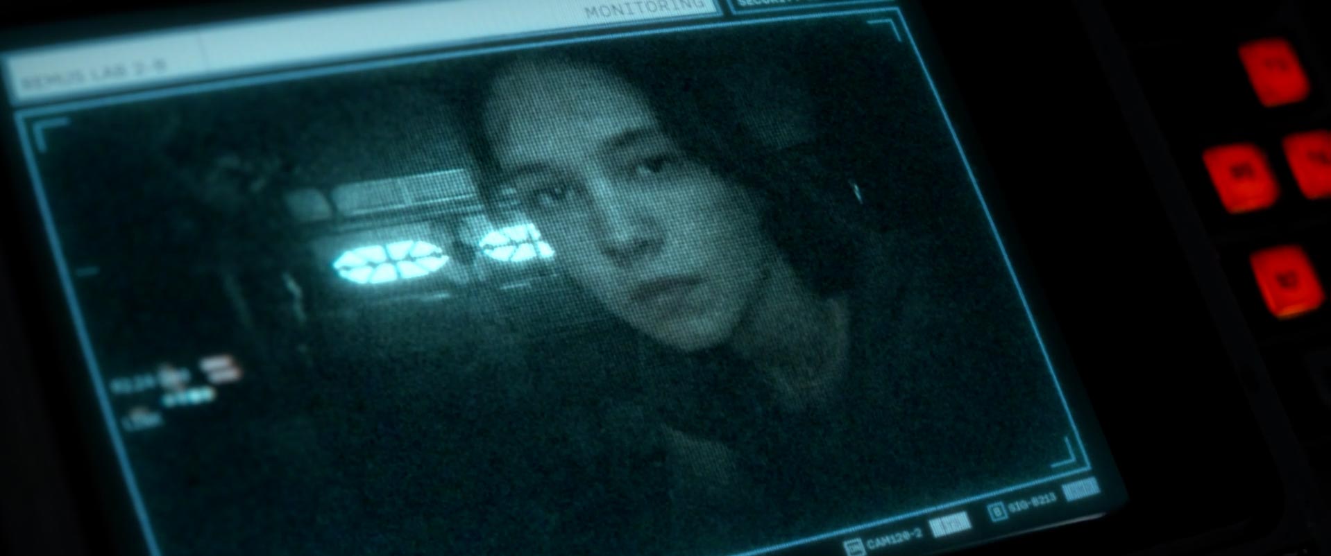
The Remus science lab is where the crew finds the android Rook amongst idle screens of various ressearch being done on the xenomorph.
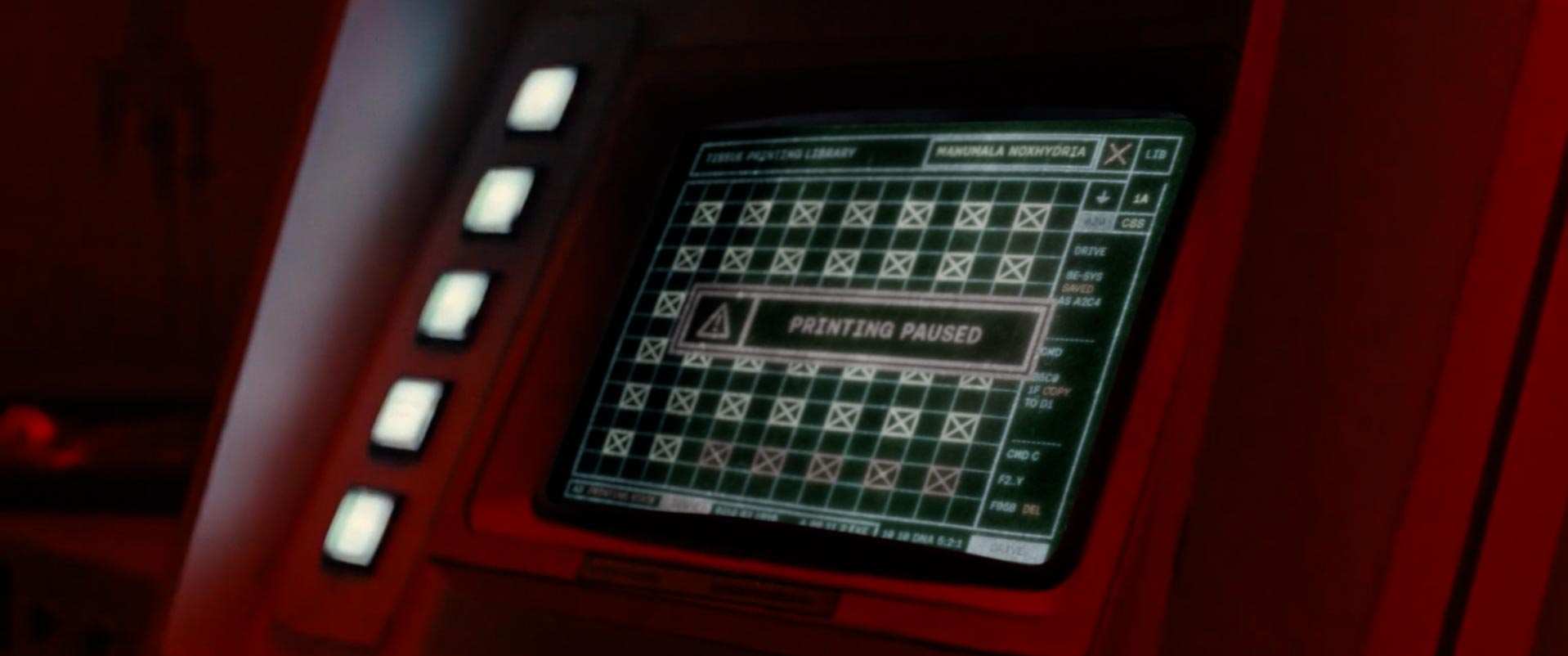
Facehugger Cryochamber
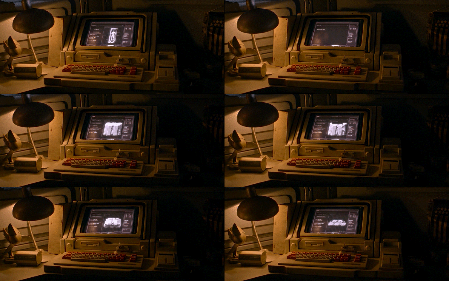
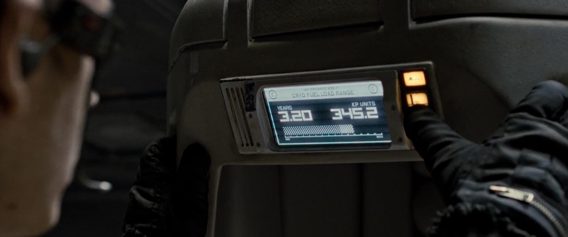
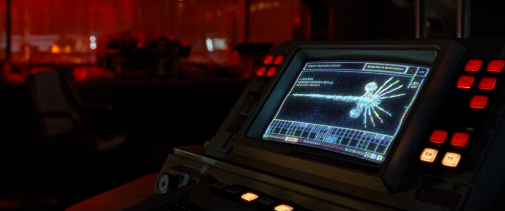
The cryochamber is the horrofic hatchery where the facehuggers were being created. Seen are more idle screens showing various stages of 3D printing. I had to try and come up with the content of the science behind the 3D printing operation of an alien parasite, including the printer type and kind of ink being used.
Rook's Terminal
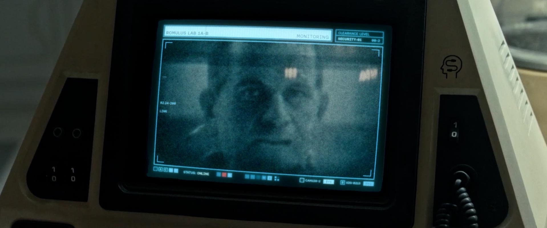
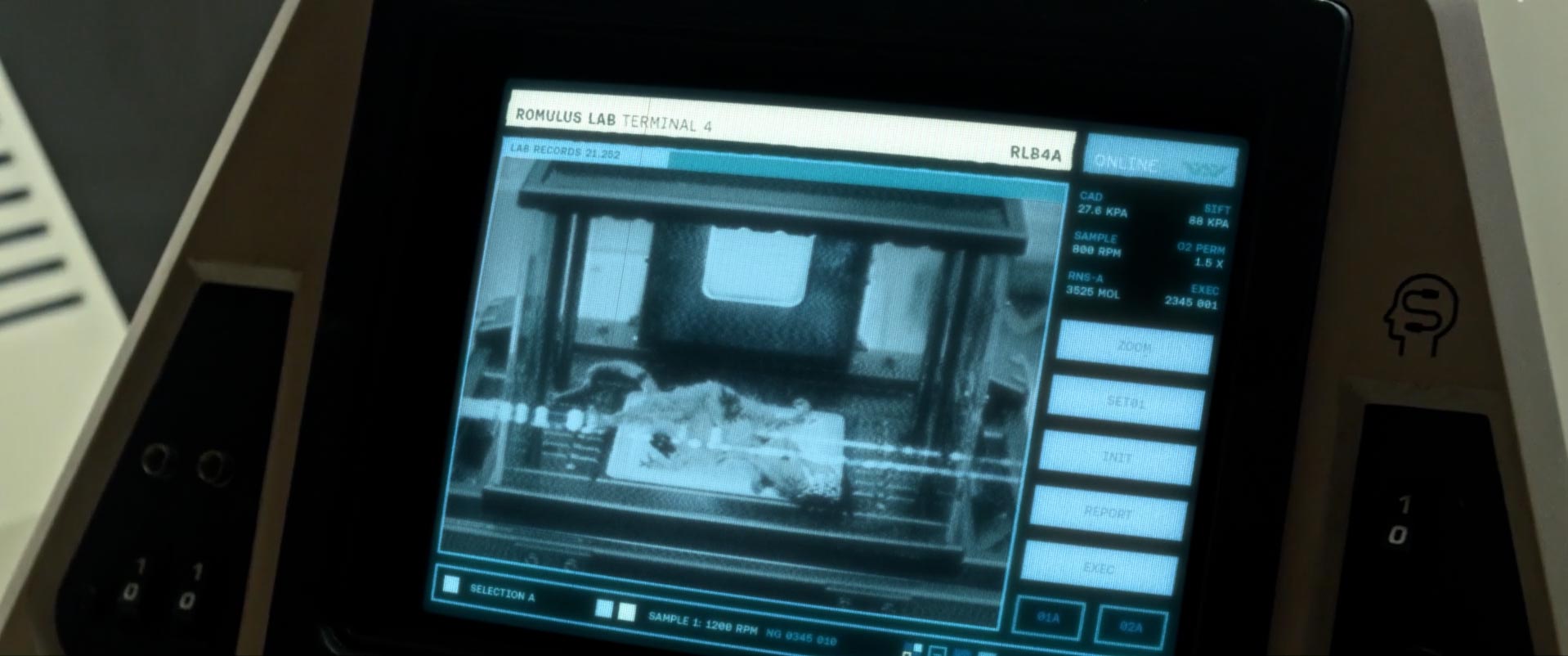
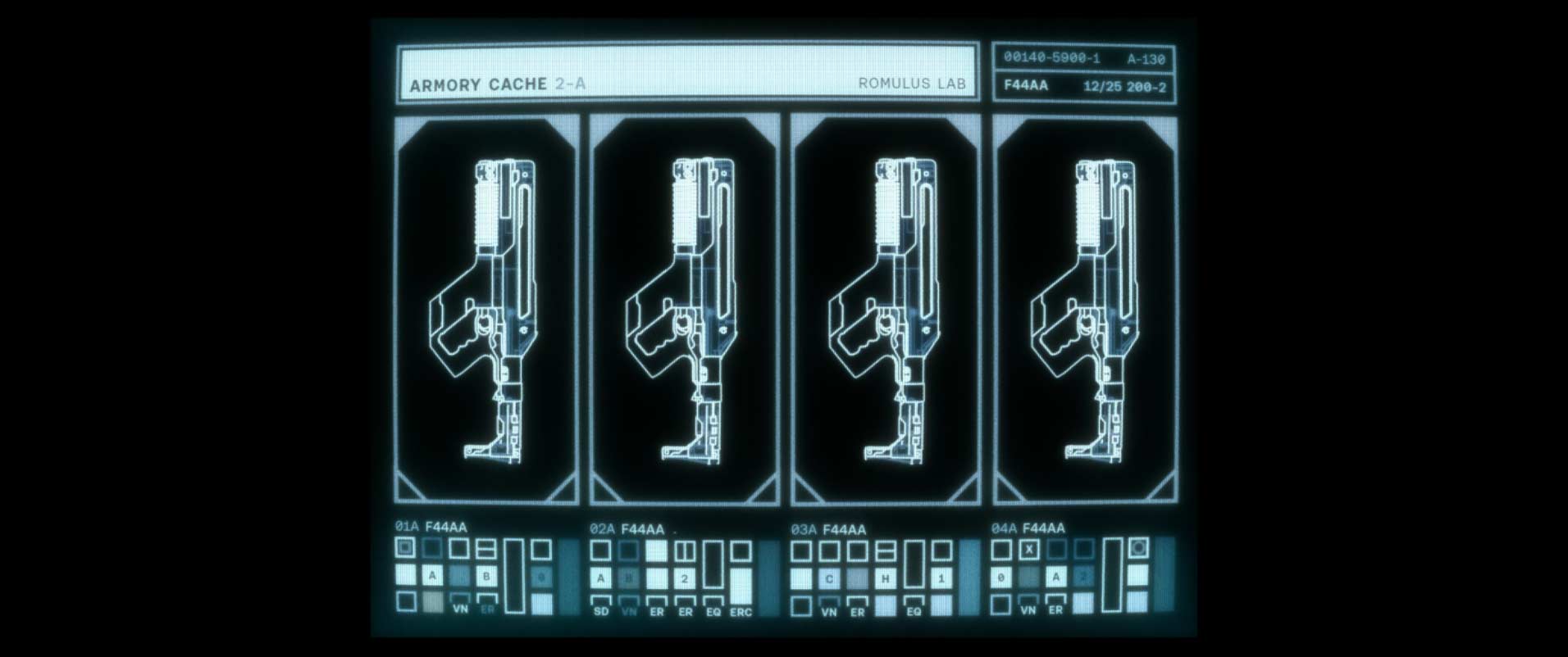
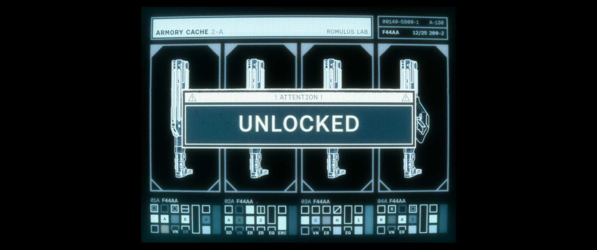
Romulus Lab / The Armory
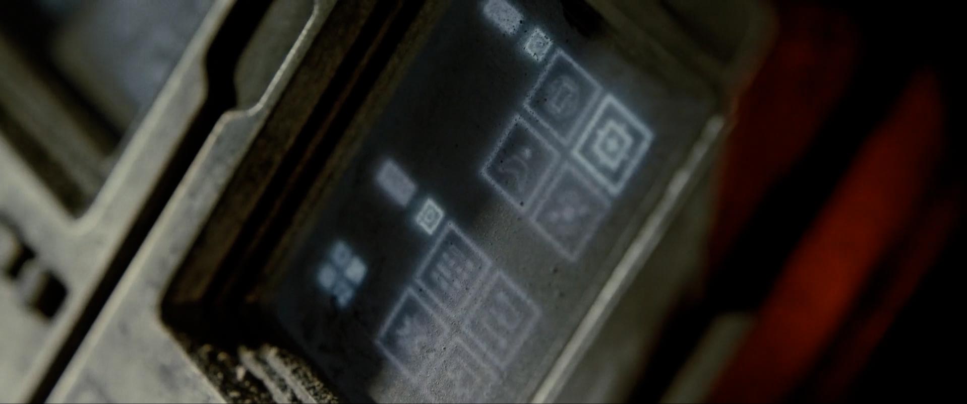
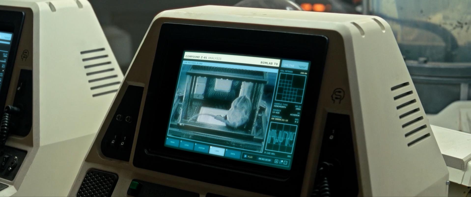
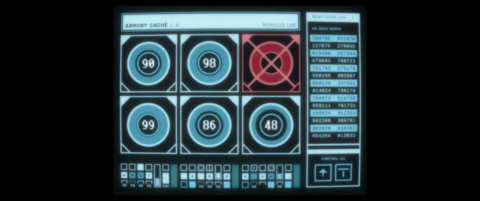
The Romulus wing of the station is the newest and most advanced. This is where more of the high level research was being done, so I wanted to give these screens a bit of a cleaner look with a slightly more distinct color palette. The armory is also here where we find the cool new model of the pulse rifle.
Collision / The Escape
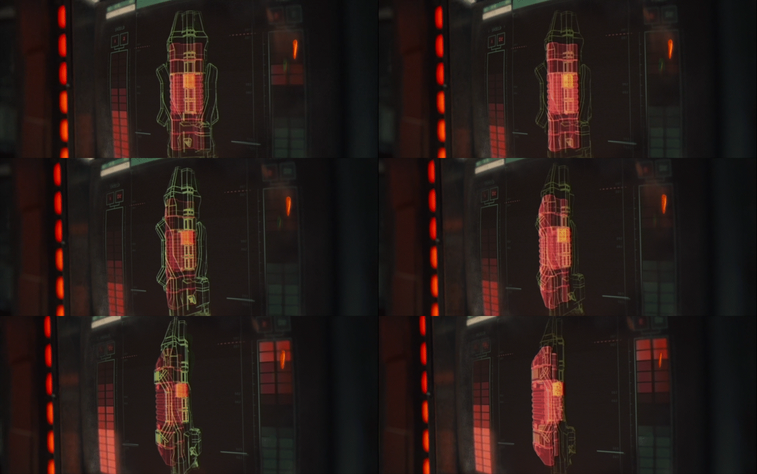
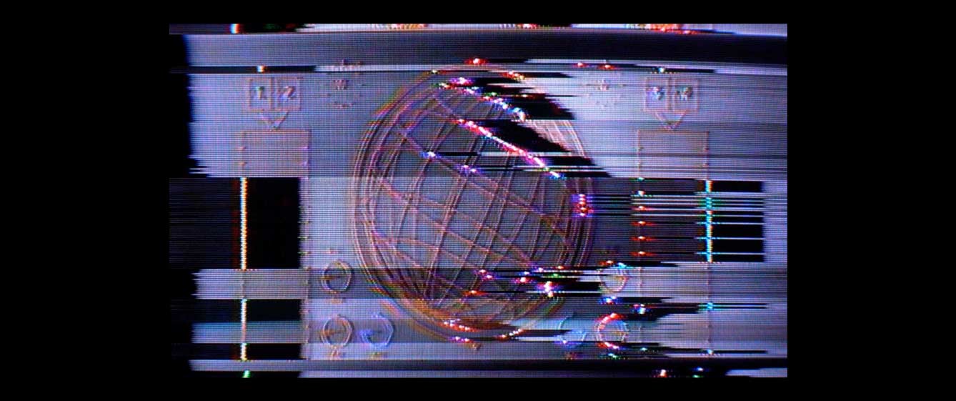
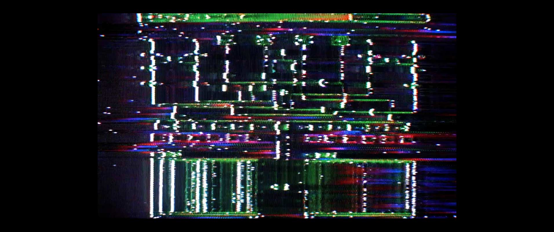
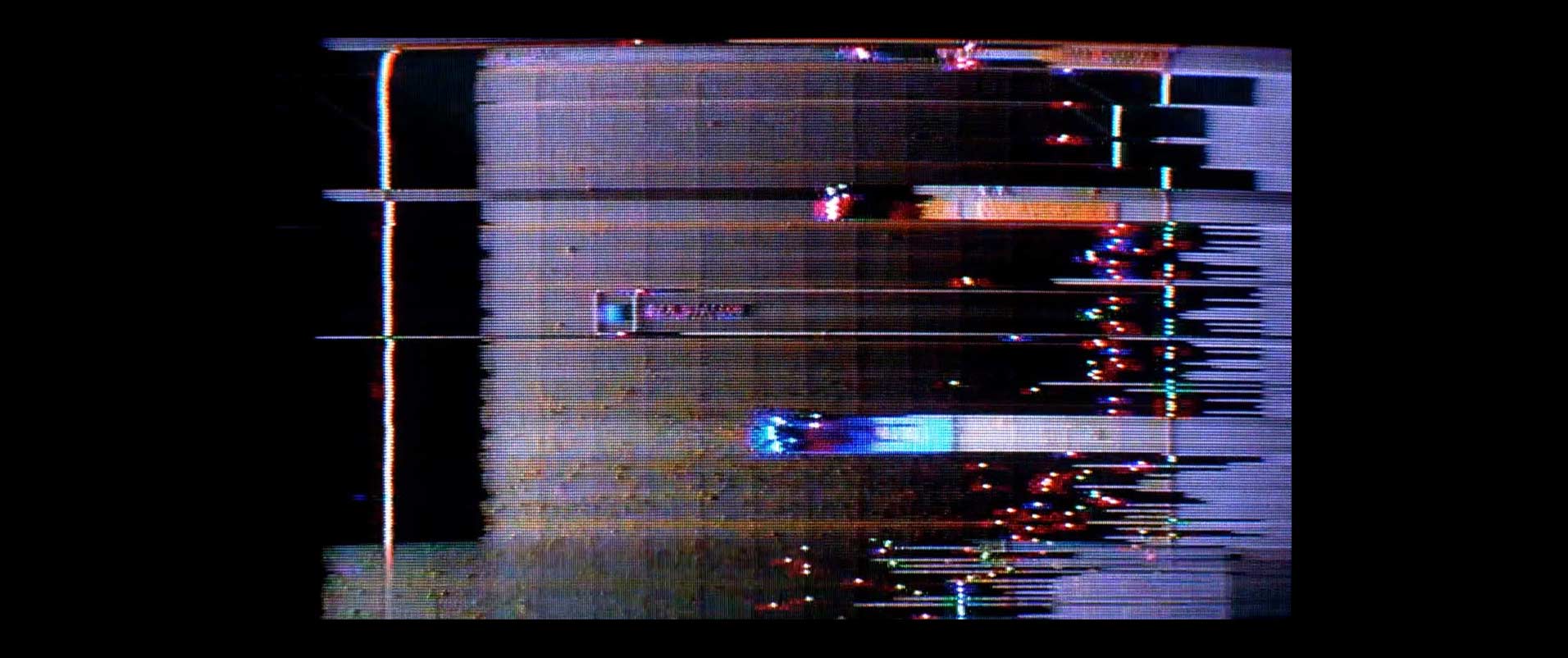
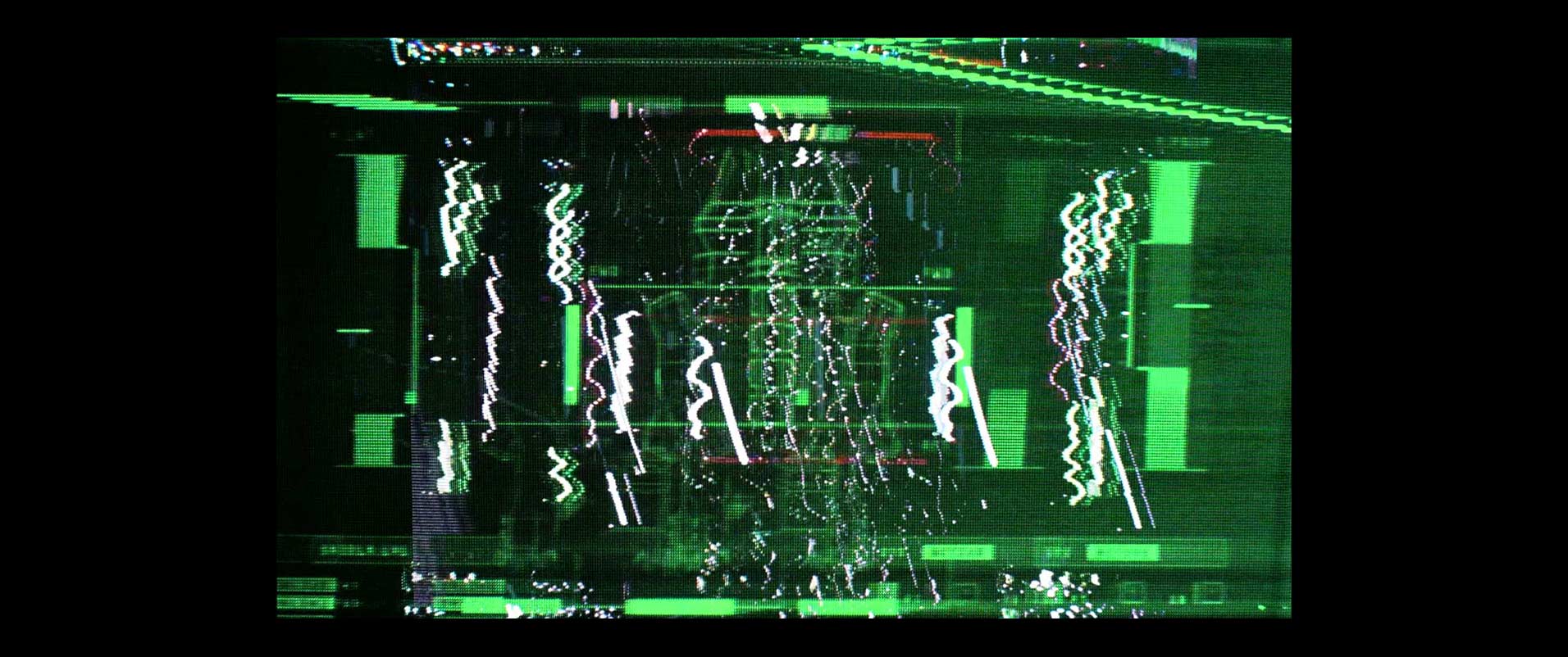
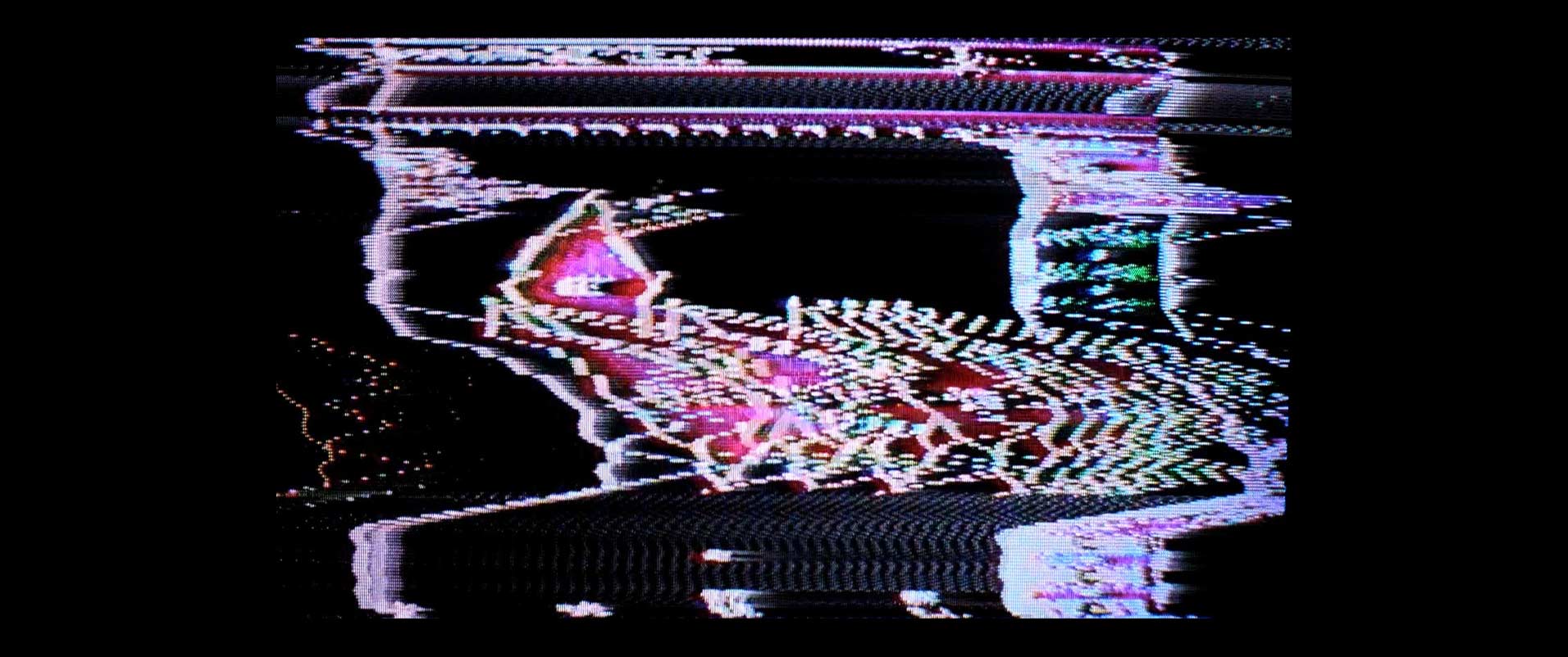
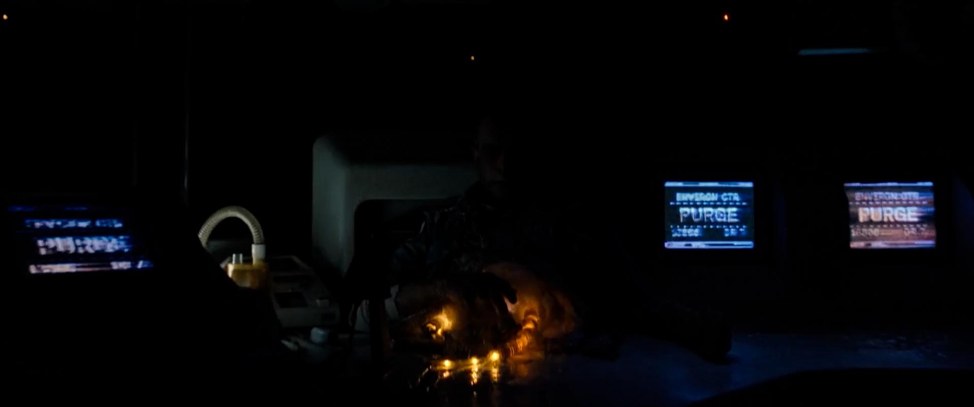
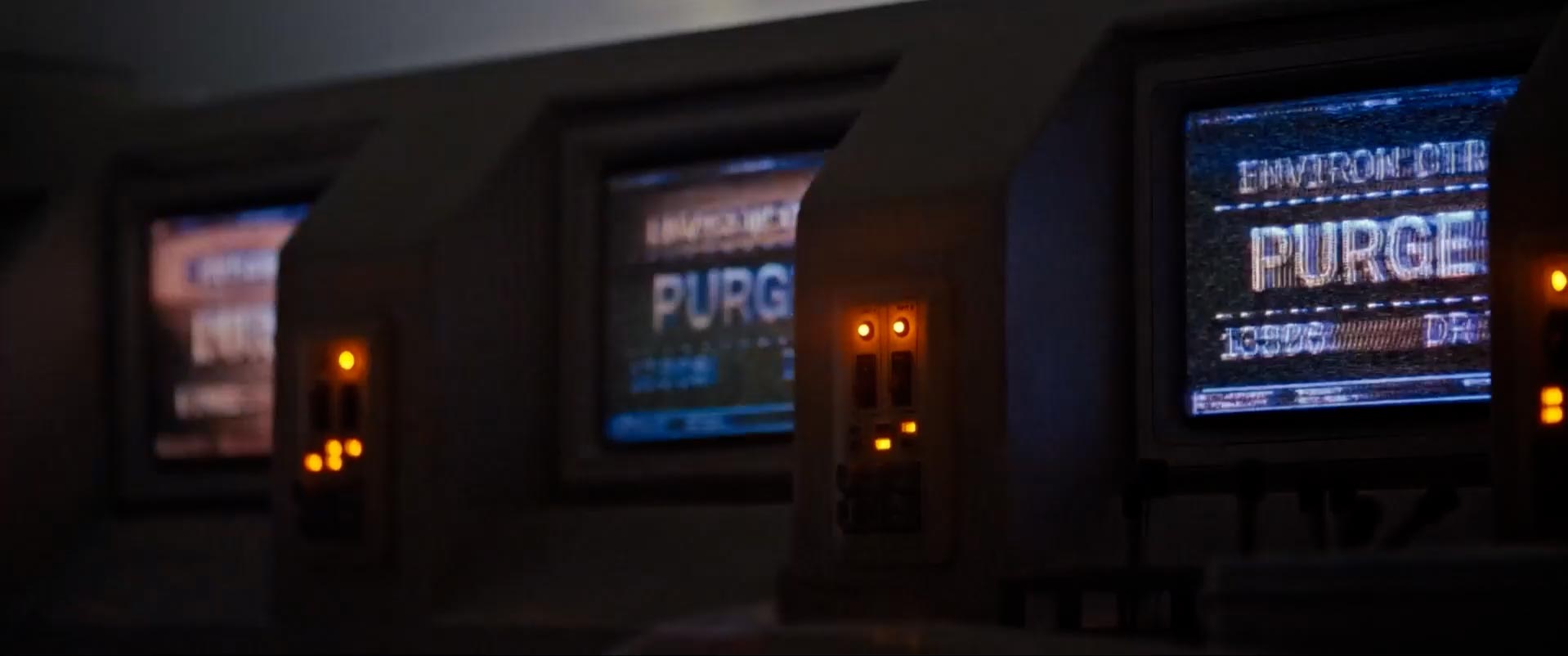
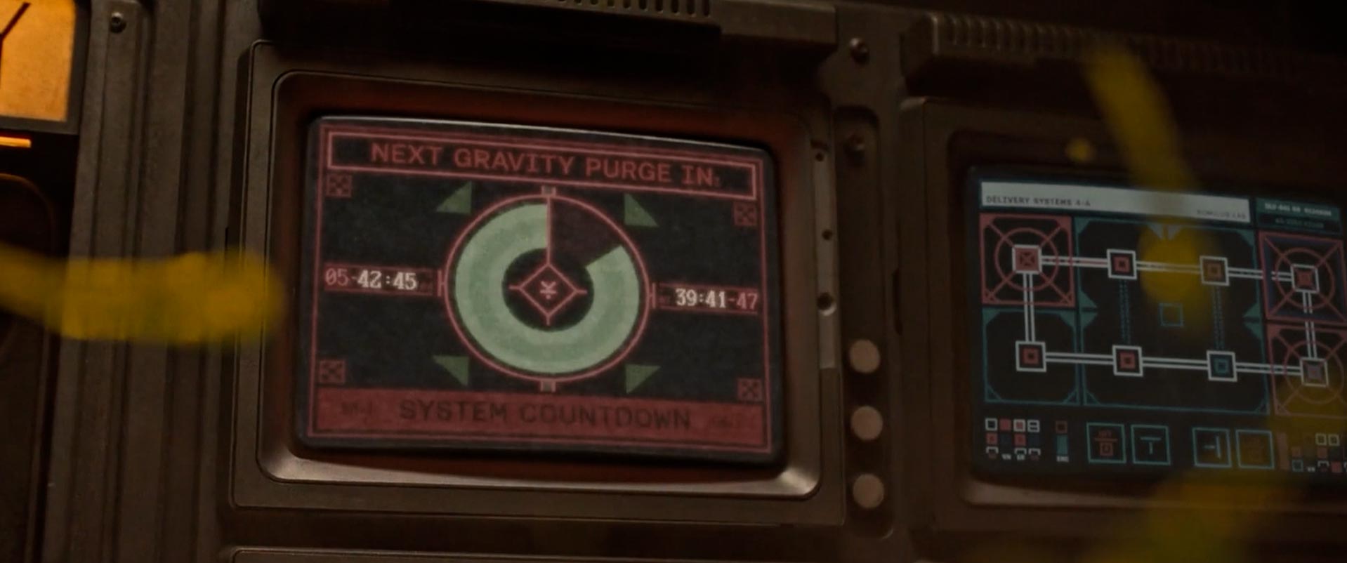
One of the most fun scenes to work on was the Renaissance's collision into the asteroid field. Not only did I get to redesign the classic "PURGE" screen, but I was able to enlist Tachyons+ to run the footage through his custom analog video synthesizers to achieve the perfect glitching for the occasion.
——
——
——
——
( Hello )
This is the work of designer / director Jason Forrest.
( Contact )
Los Angeles, CA
jason@forresthogg.com
